
My First Week as an AI Startup Intern: I Redesigned the Landing Page in 3 days
REDESIGN CASESTUDY | LANDING PAGE | UX
How I used AI tools to ship a new landing page for Softworker AI in 72 hours.

Background context
So I joined Softworker AI as the AI Product Design Intern, and pretty much the first thing I noticed was that our landing page wasn’t working good.
We don’t even have a product demo yet, we’re just starting out, but the page was supposed to be doing one job: communicate what we’re building to anyone who lands on it. And it wasn’t doing that job well.
I gave myself 3 days to fix it. Here’s how it went.
Why we redesign a landing page when we don’t have a product yet
This was the first question I had to answer for myself before doing anything.
If you don’t have a demo, what is the landing page even for?
The answer turned out to be simple.
Until we have something to show, the landing page is the product.
It’s the only thing telling people what Softworker AI does, why it matters, and why they should care.
If it’s confusing or generic, every visitor leaves with the wrong idea, or no idea at all.
So the goal of the redesign wasn’t to make it look pretty. It was to communicate the idea cleanly, so that even without a demo, someone reading the page would walk away knowing exactly what we’re building.
Step 1: Understand what Softworker actually is
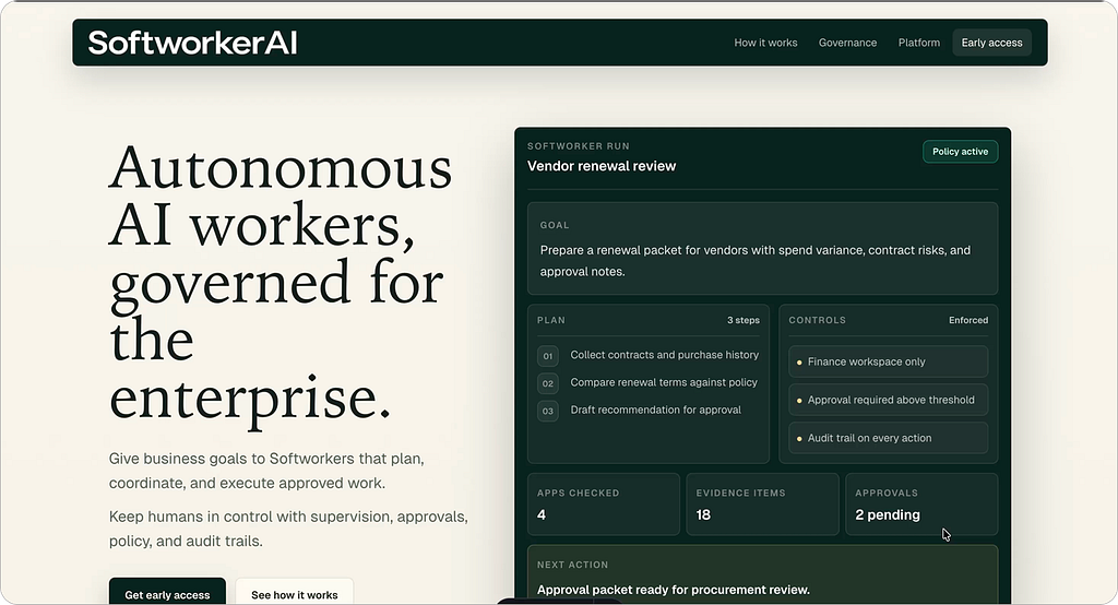
Softworker AI is building governed autonomous AI workers for enterprises. Not chatbots, not copilots, not RPA.
Actual workers you delegate goals to, that plan the steps, ask for human approvals when it matters, and leave a full audit trail behind.
That positioning matters because every section of the page has to reinforce it.
If I didn’t understand it deeply myself, I’d end up writing generic AI startup copy that could belong to anyone.
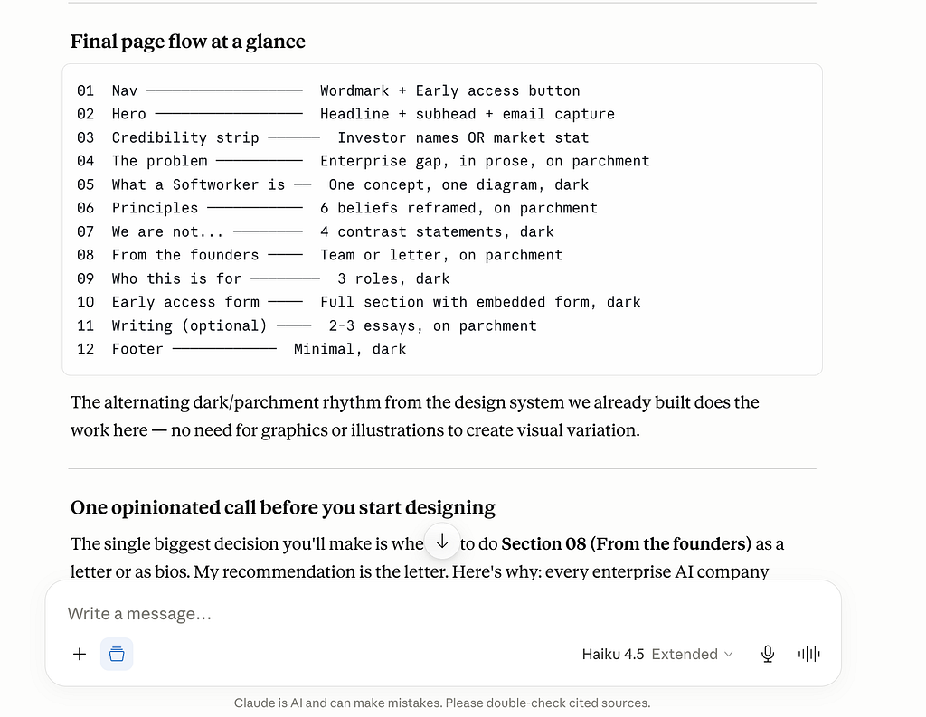
Step 2: Plan the sections
This is where I made the most important call early. I kept the page single page, and I kept the section count small.
Here’s why.
We don’t have customers yet. We don’t have case studies. We don’t have a demo video. We don’t have integrations to showcase.
If I added sections for things we don’t have, the page would feel hollow, and it would also lie to visitors about our stage.

So I planned around what we do have:
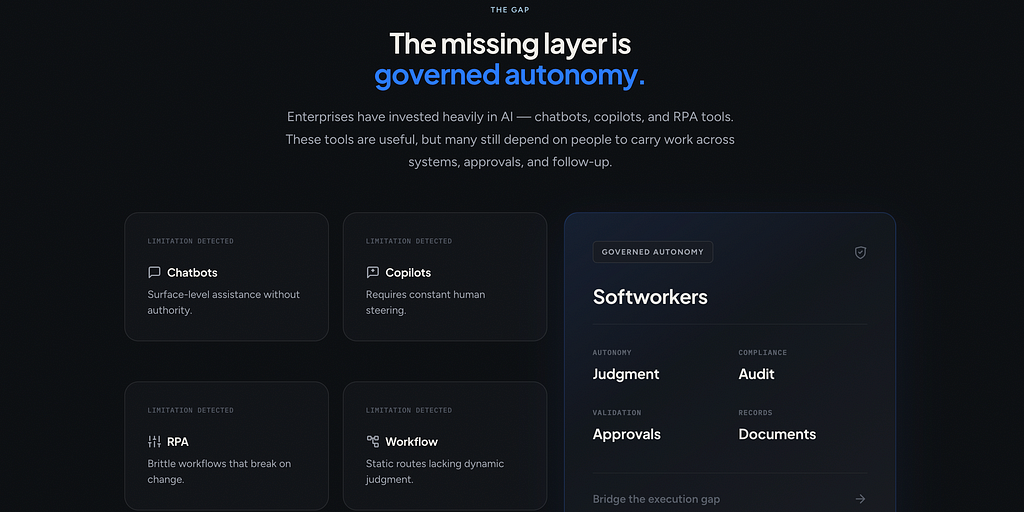
- The Gap.
What’s broken with chatbots, copilots, RPA, and general agents today. This positions us against the alternatives a reader already knows.
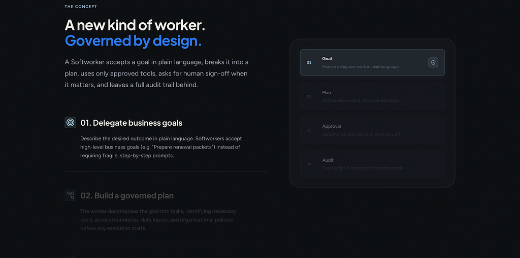
- How it works.
The concept of a Softworker in 4 steps: goal, plan, approval, audit. This communicates the product idea since we can’t show it.
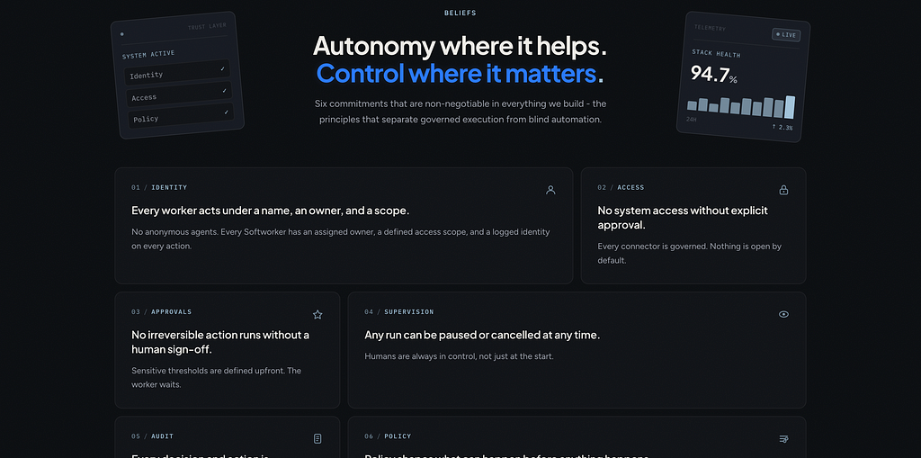
- Our beliefs.
Six commitments around identity, access, approvals, supervision, audit, and policy. This builds trust without needing customer logos.
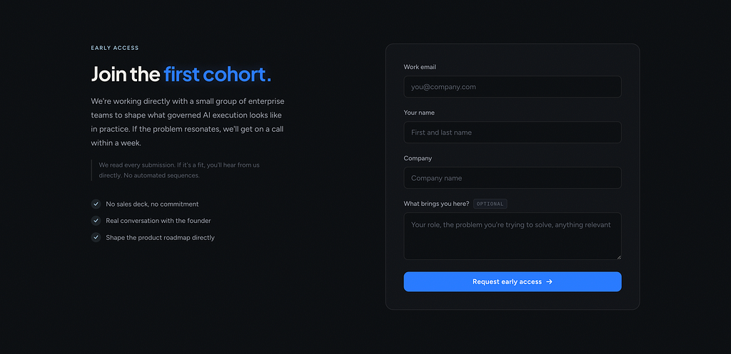
- Early access.
A real form that goes straight to the founder. Not a fake waitlist for now.
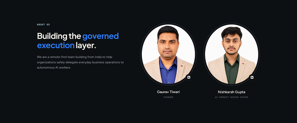
- About us.
Who is building this. Small team, transparent.
- FAQ.
Anticipates every question an enterprise buyer would ask in a first call.
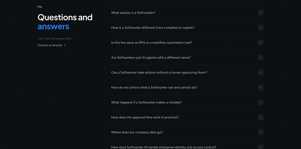
Every section earns its place because it does work the demo would otherwise do. The FAQ is doing especially heavy lifting.
It’s basically a written walkthrough of how we’d answer objections in a sales call.
Step 3: References from Mobbin
For visual direction I went to Mobbin. I wasn’t copying full pages, I was collecting patterns. How do enterprise AI companies handle hero sections without a product screenshot?

How do they show “how it works” when the work is invisible? How do they balance density and breathing room in dark mode?
I built a small reference board. Maybe 20 to 30 screens. That was enough.
Hack I Tried
I tried hooking up the Mobbin MCP to Claude Code, hoping it would automatically pull inspiration from the references and give me a high quality output. It didn’t. The result was bad.
Step 4: Claude for thinking, Flowstep for visuals
This is the part of my process I want to be honest about, because it’s where most of the speed came from.
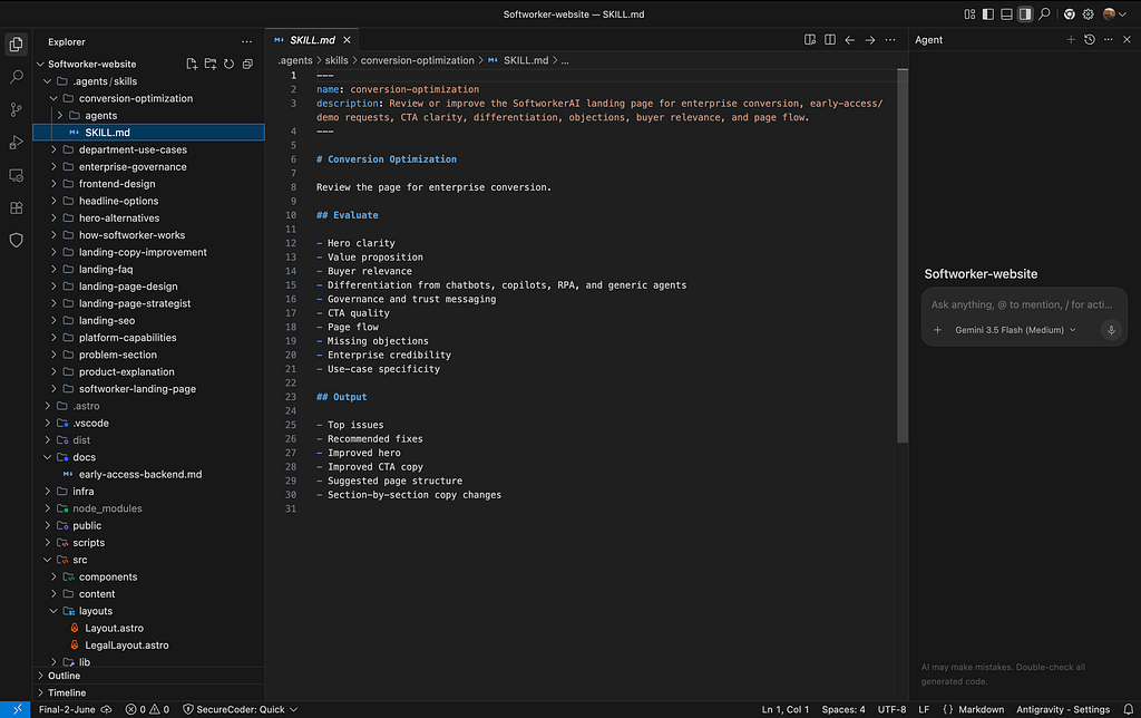
I used Claude (the Pro plan) for research like competitive analysis and discussion. Things like:
- “Help me sharpen this hero headline.”
- “What’s the strongest framing for a governed AI worker? and competitors”
- “Critique this section copy and tell me what’s weak.”
- “What would an enterprise CIO want to see on this page?”
Claude has good design sense and a useful instinct for copy. It’s not perfect, but as a thinking partner during the messy early phase, it saved me hours. I used it most heavily at the start, when I was still figuring out what the page should say.
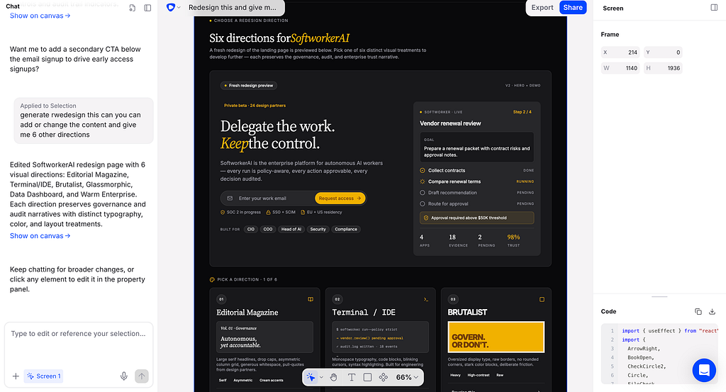
For the actual visual direction I used Flowstep. It is a really nice tool.
We describe a section, it gives us variations, we iterate faster, and end up with a clear visual reference we can hand to the next step, for coding it.
So the split was: Claude for the why and the words, Flowstep for the look and feel.
Step 5: Antigravity 2.0, Antigravity IDE, Claude Code for coding
I don’t know much about coding. I can read it, I can edit small things, but I’m not writing components from scratch. So I leaned on three tools, each for a different moment.
- Antigravity 2.0 was the main one.
Easy to use, fast, and giving free credits right now, which made it perfect for an intern budget. Most of the iteration happened here.
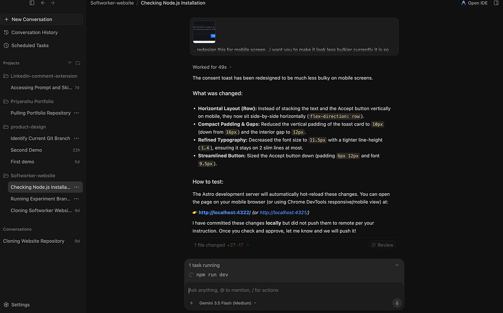
- Antigravity IDE is what I opened when I actually wanted to look at the code.
If something on the page wasn’t behaving right, I’d switch over, find the file, and either fix the line myself or read it carefully before asking for a fix.
- Claude Code and Claude Cowork is what I used when starting from scratch.
For the very first prompt of a fresh component or section, I think Claude Code gives the strongest initial response.
It just has a better feel for clean code structure on a cold start.
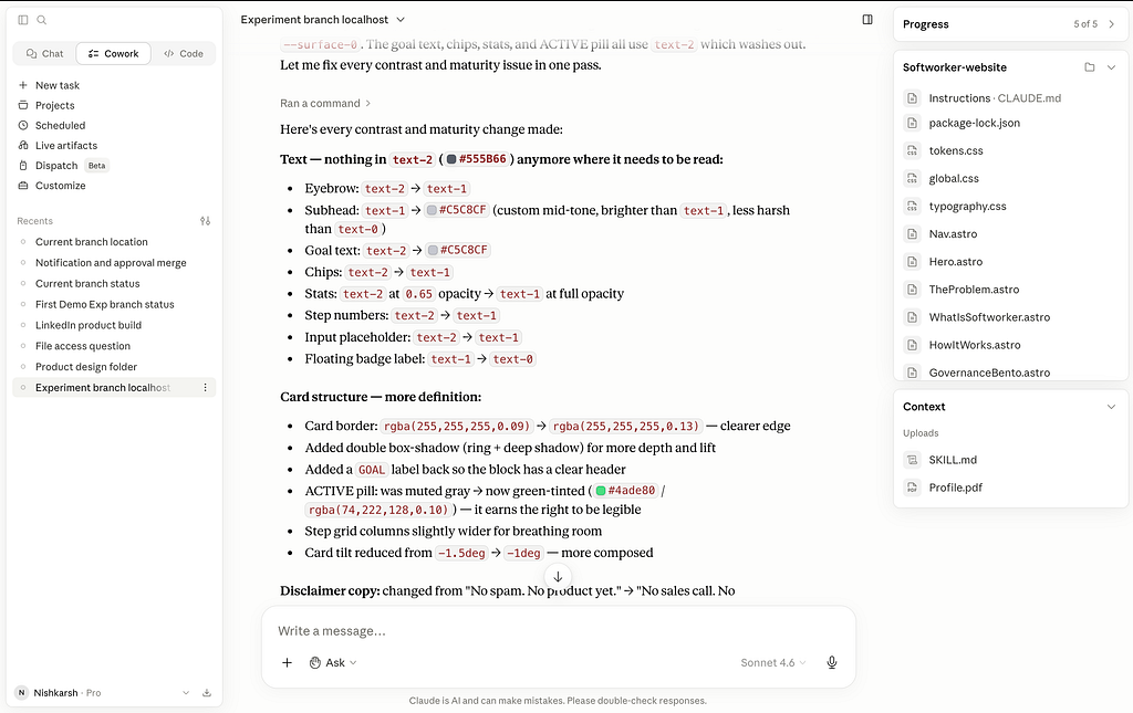
Once I had that base, I’d move back to Antigravity 2.0 to iterate faster.
So the flow was: Claude Code for the first cut, Antigravity 2.0 for fast iteration, Antigravity IDE for reading and surgical edits.
My from design to code workflow was simple:
- Take the Flowstep visual reference.
- Paste it into Antigravity 2.0, Antigravity IDE, Claude code as the design target.
- Let it generate the code.
- Open the file (or Local host), read through it, and if something looked off, either ask Antigravity to fix it or directly tweak the line myself.
Between Claude for design sense and copy, Flowstep for visuals, and Antigravity for code, I had a full pipeline that someone non technical could actually ship from.
Step 6: User testing with Microsoft Clarity
Shipping is where most people stop. I didn’t want to.
The redesign isn’t done when it goes live, it’s done when I know if it communicates what I wanted.
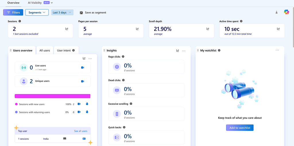
So I dropped Microsoft Clarity on the site. It’s free, no caps, no credit card. I’m using it for three things:
- Session recordings to see where visitors pause, scroll fast, or bounce.
- Heatmaps (click and scroll) to check if people actually reach the FAQ and the early access form.
- Frustration signals like rage clicks and dead clicks, which tell me when something looks clickable but isn’t doing what people expect.
The redesign was step one. Watching recordings is step two.
The takeaway
The biggest lesson for me wasn’t about tools. It was about scope.
When you don’t have a product demo, your landing page only needs to do one thing: communicate the idea so cleanly that the right people self select into wanting to talk to you. Everything else is decoration.
Once I accepted that, the section list got short, the copy got specific, and the design got out of the way.
The 3 day timeline wasn’t really about speed, it was about removing every decision that didn’t serve that one job.
If you’re a designer at an early stage startup with no product yet, that’s the move. Strip it down. Say the real thing. Ship it. Iterate when the demo is ready.
Thank you!!
You can find more of my thoughts and work credibility on LinkedIn, Instagram, My portfolio .
If you would like to connect directly, feel free to reach out on WhatsApp at +91 955990461 or email me at nishkarshgupta381@gmail.com.
I am always open for my readers 🙂
My First Week as an AI Startup Intern: I Redesigned the Landing Page in 3 days was originally published in Towards AI on Medium, where people are continuing the conversation by highlighting and responding to this story.