
My EfficientNet Scored Worse Than Logistic Regression, Here’s What Changed…
I spent several weeks on the Messy Mashup Kaggle competition, a music genre classification challenge where the test data sounds like someone threw ten songs into a blender with a vacuum cleaner running in the background. This is the story of how I went from a naive 0.15 F1 baseline to a 0.9031 F1 ensemble, and all the wrong turns along the way.
Quick note on F1 score: If you’re new to ML, F1 is a metric that balances precision (how many of your predictions are correct) and recall (how many correct answers you actually found). It ranges from 0 to 1, higher is better. Macro F1 averages the F1 across all classes equally, so the model can’t cheat by just getting good at a few easy genres and ignoring the rest.
The Problem
Music genre classification sounds solved. Load audio, extract features, train a classifier, done. I thought so too, until I actually looked at what we were working with.
The training data is clean: 1,000 songs across 10 genres (blues, classical, country, disco, hiphop, jazz, metal, pop, reggae, rock), each separated into four instrument **stems**: drums, vocals, bass, and “other” (which covers guitars, keyboards, synths, strings… basically everything that defines a genre’s sound). These are studio-quality separations. Nice and tidy.
The test data is chaos. Each test sample is a 30-second mashup created by mixing stems from different songs within the same genre, warping their tempos to sync up, and then dumping environmental noise on top. Dogs barking, rain, traffic, vacuum cleaners, whatever was lying around in the ESC-50 dataset (a widely used collection of 2,000 environmental sound clips).
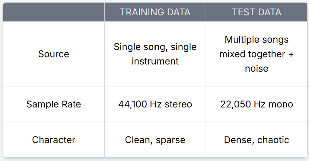
What’s a sample rate? It’s how many audio snapshots are captured per second. 44,100 Hz (CD quality) means 44,100 measurements per second. The test data is downsampled to 22,050 Hz and converted from stereo (2 channels) to mono (1 channel), so it literally contains less information than the training data.
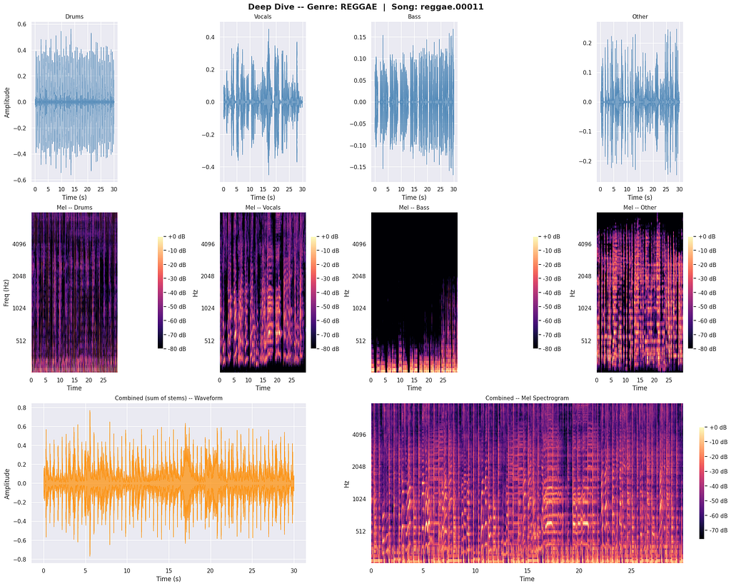
Here’s a clean reggae song broken into its stems:
And here’s a real test mashup:
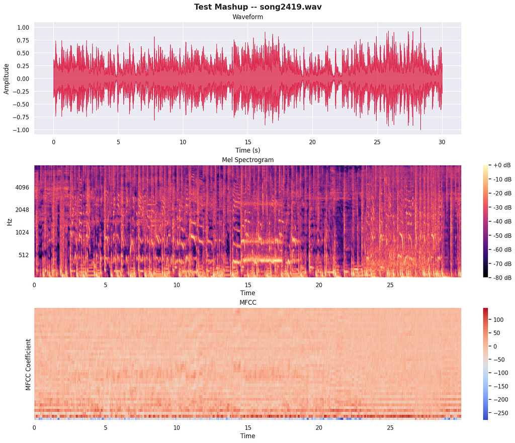
The moment I visualized this side-by-side, I knew training directly on clean stems would be useless. Whatever model I built would need to learn from data that looks like the test set, not the training set. That realization (that this is fundamentally a data problem, not a modeling problem) ended up being the most important insight of the entire project.
Why Five Milestones
Early on, I made a deliberate decision to structure this project as a progression of five increasingly sophisticated approaches rather than jumping straight to a pretrained model. There were a few reasons:
- Debugging. If my final model fails, I need to know why. Is it the data pipeline? The features? The architecture? The training? By building up incrementally (heuristics, then classical ML, then CNN, then RNN, then pretrained), each layer validates the one below it.
- Understanding. I wanted to genuinely understand what each modeling paradigm brings to the table. It’s easy to fine-tune an EfficientNet and call it a day, but you learn nothing about why it works or what happens when it doesn’t.
- Ensembling. Different architectures make different mistakes. A CNN trained from scratch, an LSTM with attention, and a pretrained EfficientNet all have different inductive biases. Even if the EfficientNet is clearly the strongest, the others contribute useful signal at the margins.
What’s ensembling? Instead of trusting a single model, you train multiple models and combine their predictions, usually by averaging. If model A is wrong on sample X but models B and C are right, the majority wins. It’s one of the most reliable ways to improve accuracy. More on ensembling.
The progression ended up looking like this:
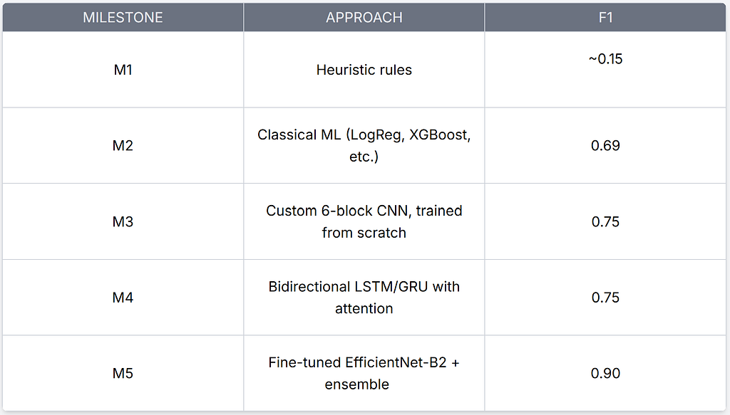
Each milestone taught me something the next one needed.
I logged everything to Weights & Biases as I went. It saved me more than once when I needed to figure out what changed between versions.
M1: Heuristic Baseline (~0.15 F1)
I didn’t expect the heuristic to work. That wasn’t the point. The point was to force myself through the entire dataset before writing any real model code.
I extracted six features from each audio sample and wrote a branching decision tree by hand:
What are audio features? Think of them as numbers that describe how audio sounds without storing the raw waveform. For example:
- Spectral centroid, the “center of gravity” of the frequencies. A bright, treble-heavy track (like metal) has a high centroid; a dark, bass-heavy track (like reggae) has a low one.
- Tempo, beats per minute.
- RMS energy, overall loudness.
- Zero-crossing rate, how often the waveform crosses the zero line. Percussive and noisy audio crosses more often.
- Spectral flatness, how “noise-like” vs “tone-like” the audio is.
Librosa’s feature extraction docs are a great reference for all of these.
if quiet and dark_spectrum:
    predict "classical"
elif loud and bright and percussive:
    predict "metal"
elif strong_beat and mid_energy:
    predict "disco"
It scored about 0.15 F1. Barely above the 0.10 random baseline (since there are 10 genres, randomly guessing would get about 1 in 10 right). But the EDA I did alongside it was worth every minute.
What’s EDA? Exploratory Data Analysis, basically looking at your data from every angle (distributions, visualizations, statistics) before you start modeling. It helps you spot patterns, outliers, and problems early. More on EDA.
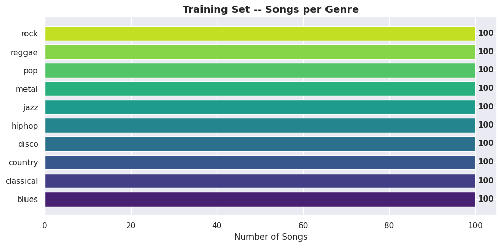
The dataset is perfectly balanced, 100 songs per genre, no class imbalance to worry about:
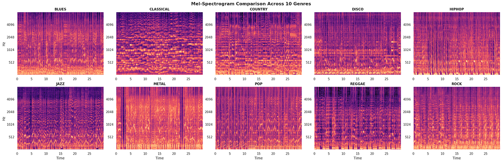
Each genre has a distinct visual signature in its spectrogram, at least when the audio is clean. Classical is sparse with clear harmonic lines. Metal fills the entire spectrum. Jazz has these intricate, irregular temporal patterns:
What’s a spectrogram? It’s a visual representation of audio. The x-axis is time, the y-axis is frequency, and the color/brightness indicates how loud each frequency is at each moment. Think of it as a heatmap of sound. You can literally see what music sounds like. Visual explainer.
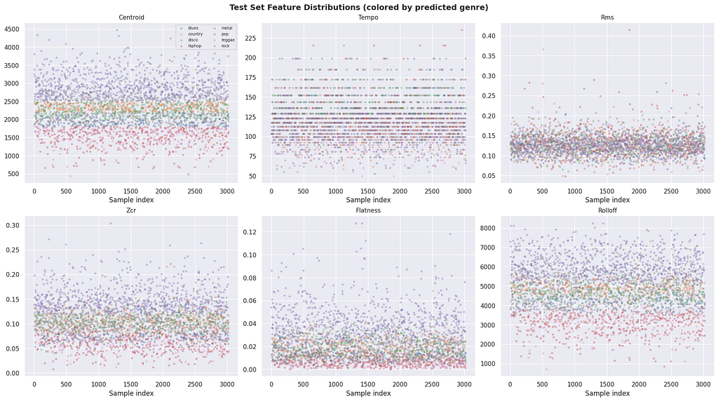
But the domain shift is brutal. I plotted feature distributions for training stems vs. test mashups, and every single feature was shifted:
What’s domain shift? When your training data and test data have different statistical properties. A model trained on clean studio audio performs poorly on noisy real-world audio because the patterns it learned don’t transfer. This is one of the hardest problems in machine learning. More on domain shift.
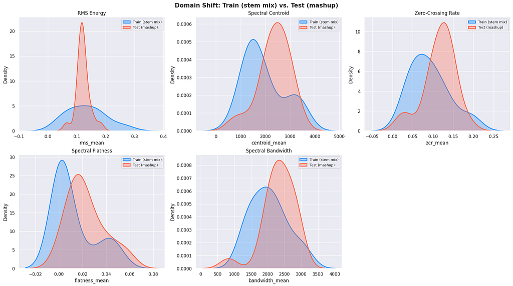
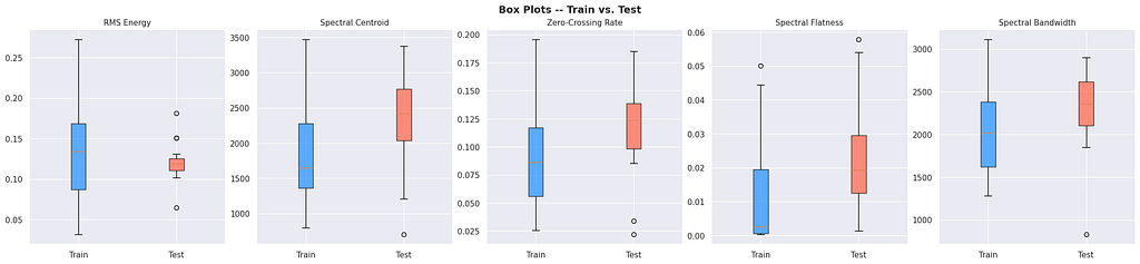
Test mashups have higher spectral centroids, wider bandwidths, more zero-crossings, all consistent with multiple overlapping sources plus broadband noise. Any model trained on clean stem features would see the test data as out-of-distribution.
I also dug into the ESC-50 noise dataset. 2,000 clips across 50 categories, from crickets to chainsaws, each injected at random SNR (signal-to-noise ratio) levels:
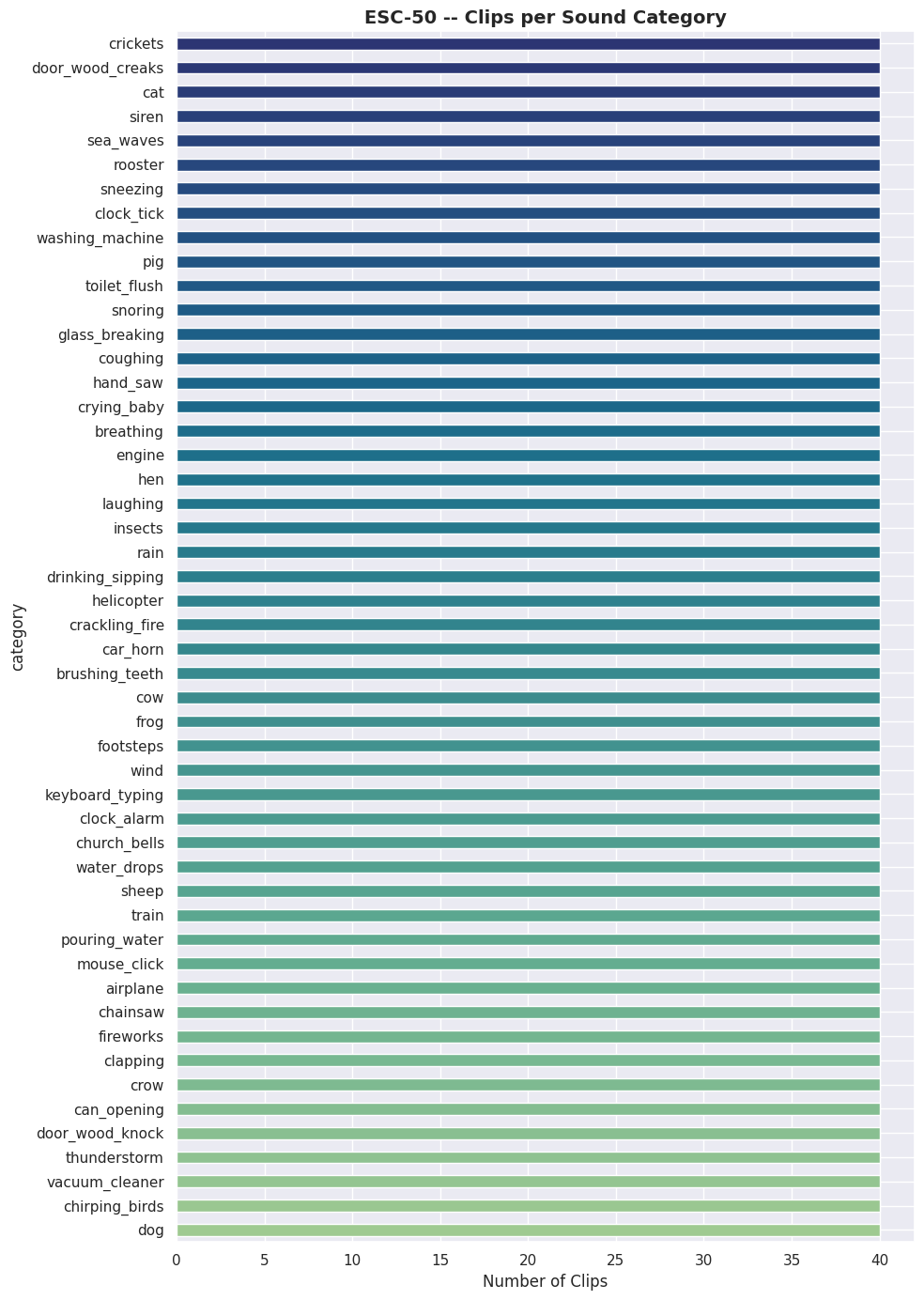
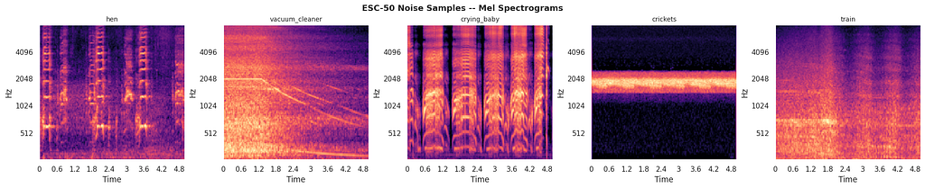
Some of these noise profiles are genuinely adversarial. A vacuum cleaner produces broadband noise that smears across the entire spectrogram. Crickets add high-frequency hash. A crying baby has spectral content right in the vocal range. The model needs to be robust to all of them.
Other things I found: some vocal stems had 10+ seconds of silence. Several jazz drum tracks were mostly empty. A few files were corrupted (< 4 KB). All of this meant the mashup generator I’d build later needed robust error handling. You can’t just blindly load and mix files.
M2: Classical ML and Feature Engineering (0.69 F1)
Here’s where things started getting interesting. I built a synthetic mashup generator. This turned out to be the piece of code that mattered more than any model architecture.
The generator does what the test data creation process does (as far as I could figure out from the competition description):
- Pick a genre. Randomly select 4 songs from that genre.
- Take one stem from each: drums from song A, vocals from song B, bass from C, other from D.
- Apply random tempo stretching (0.8× to 1.2×) to simulate the tempo alignment described in the competition.
- Mix them together with random per-stem gains (0.3× to 1.7×).
- 80% of the time, add a random ESC-50 clip at 5–20 dB SNR.
- Peak-normalize.
I generated 2,000 synthetic mashups (200 per genre) and extracted a 195-dimensional feature vector from each.
What are MFCCs? Mel-Frequency Cepstral Coefficients, probably the most widely used feature in audio/speech processing. They work by:
- Converting audio into a spectrogram
- Mapping the frequencies to the mel scale (which mirrors how humans perceive pitch, we’re better at distinguishing low frequencies than high ones)
- Taking a compressed representation of that mel-spectrogram
The result is a compact set of numbers that describe the timbral texture of sound, roughly, the “color” or “tone quality.” A flute and a guitar playing the same note have different MFCCs because they sound different even at the same pitch. I used 40 MFCC coefficients and computed 4 statistics (mean, std, max, min) for each, giving 160 features.
The full 195-dim vector: 160 MFCC features + 24 chroma features (which capture pitch/chord information, think musical key) + 11 spectral descriptors (centroid, bandwidth, etc.).
Then I threw every classifier I could at it. The result genuinely surprised me:

Quick primer on these models: Logistic Regression draws straight-line boundaries between classes. Random Forest builds hundreds of decision trees and votes. XGBoost, LightGBM, and CatBoost are gradient boosting frameworks, they build trees sequentially, each one trying to fix the mistakes of the previous ones. Soft voting ensemble averages the probability outputs of all models.
Logistic Regression beat all the boosters. On a 10-class audio classification problem. I double-checked the results because it felt wrong. But it makes sense in retrospect: with balanced classes and a well-constructed feature vector, the decision boundaries are approximately linear. The boosters overfit on 2,000 samples.
The feature importance plots were revealing. MFCC_3_mean dominated everything, both in Random Forest and LightGBM:
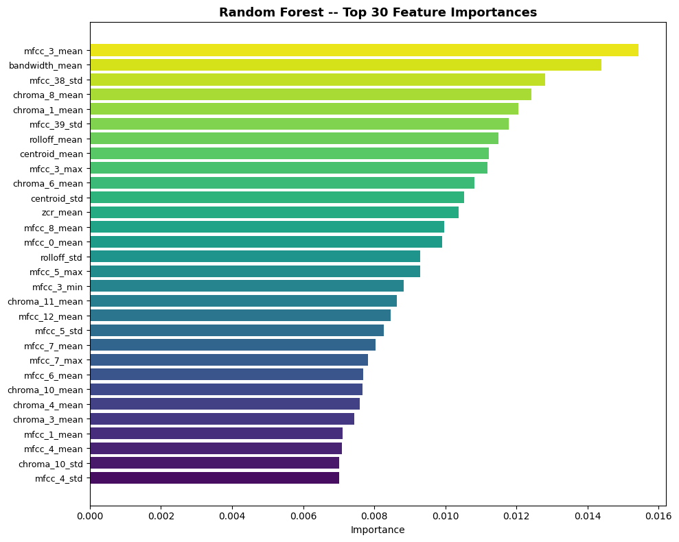
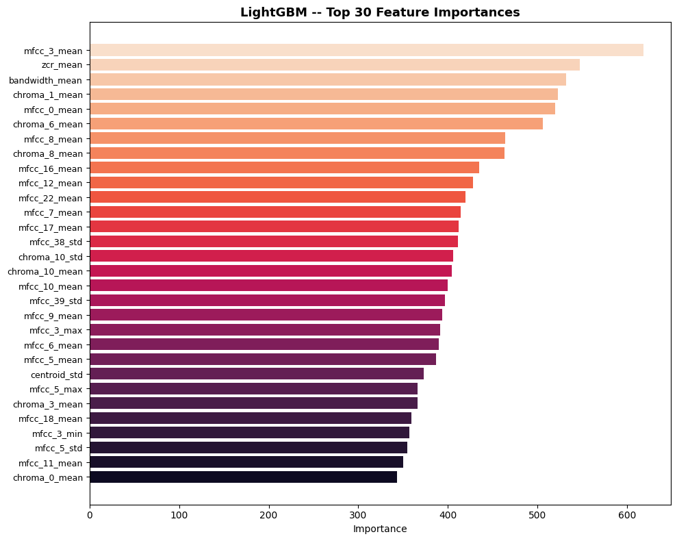
This told me two things: MFCCs (which are derived from mel-spectrograms) carry most of the genre signal, and the summary statistics (mean, std, max, min) are throwing away temporal information that might matter. A neural network operating directly on the full mel-spectrogram could learn richer patterns.
Why does this matter? When I extract 4 stats per MFCC, I’m summarizing 30 seconds of audio into a single number (e.g. “the average brightness of the sound”). That throws away when things happen. A quiet intro followed by a loud chorus gets averaged into “medium loudness.” A neural network looking at the full spectrogram can see the quiet-then-loud pattern and use it.
The confusion matrix showed where the ensemble struggled:
What’s a confusion matrix? A grid where rows are the true genre and columns are what the model predicted. Diagonal cells = correct predictions. Off-diagonal cells show exactly which genres get confused with each other. Visual explainer.
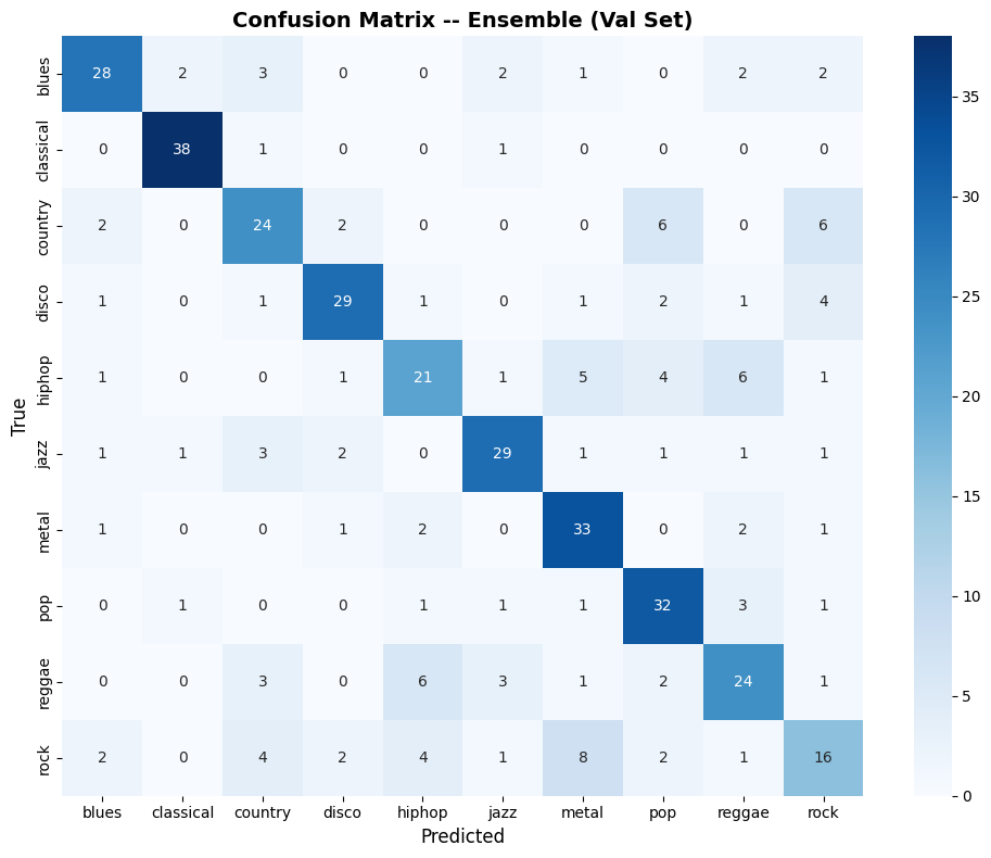
Classical: 38/40 correct. Rock: 16/40, it bleeds into country, metal, blues, and even pop. This rock-confusion pattern would persist across every model I built. It’s not a model failure; rock genuinely shares instrumentation and energy profiles with half the other genres.
The 0.69 F1 told me something important: the synthetic mashup pipeline works. Domain-matched training data + reasonable features = meaningful predictions. Now I needed better features.
M3: Custom CNN From Scratch (0.75 F1)
The transition from M2 to M3 is a paradigm shift. Instead of hand-designing 195 features and hoping they capture what matters, the CNN looks at the raw spectrogram and figures it out.
What’s a CNN? A Convolutional Neural Network, a type of deep learning model originally designed for images. It slides small filters across the input to detect patterns like edges, textures, and shapes. The key insight for audio: spectrograms are images, so CNNs work on them too. CNN visual explainer.
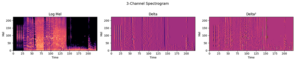
I built a 3-channel input: log-mel spectrogram + its first temporal derivative (delta, measuring how the spectrum changes over time) + second derivative (delta², measuring how fast that change is accelerating). Each resized to 224×224. The three channels capture energy, velocity, and acceleration of the sound. This maps naturally to the RGB input that any standard CNN expects.
The CNN itself was a vanilla 6-block architecture. Nothing fancy, I wanted to see what you get with pure spatial learning and zero pretrained knowledge:
(3, 224, 224) → [Conv→BN→ReLU]×2 → MaxPool → repeat 5 more times
→ channels grow: 3→32→64→128→256→384→512
→ AdaptiveAvgPool(1) → Dropout(0.5) → FC → Dropout(0.3) → 10 genres
Breaking down this notation:
- Conv = convolutional layer (pattern detector)
- BN = Batch Normalization (stabilizes training)
- ReLU = activation function (introduces non-linearity, without it, stacking layers would be pointless)
- MaxPool = downsampling by keeping only the maximum value in each patch (halves the spatial dimensions)
- Dropout(0.5) = randomly zeroes 50% of neurons during training to prevent overfitting
- FC = Fully Connected layer (standard neural network layer)
5.3 million parameters, all randomly initialized. I added SpecAugment (randomly masks rectangular blocks of the spectrogram during training, forces the model to classify even with missing information), label smoothing (softens the target from “100% blues” to “91% blues, 1% each for the rest”, prevents overconfidence), and OneCycleLR scheduling. Trained on 3,000 synthetic mashups with mixed precision (uses FP16 math for ~2× speed) on a T4 GPU.
The learning curves tell the story of a network struggling to find signal:
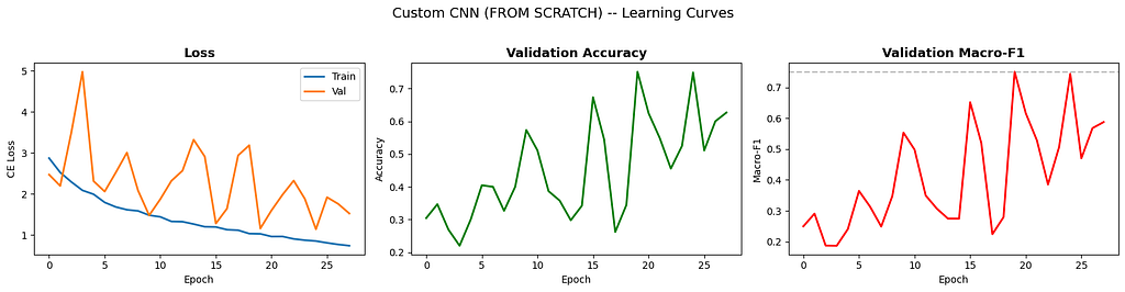
That gap between training loss (smooth blue line going down) and validation loss (orange line bouncing around) screams overfitting. SpecAugment and dropout are doing their best, but 5.3M parameters on 3,000 samples is asking for trouble. The F1 curve (right panel) is particularly telling, it jumps around between 0.2 and 0.75, and the best checkpoint is whatever lucky epoch happened to catch a good configuration.
The confusion matrix at the best epoch:
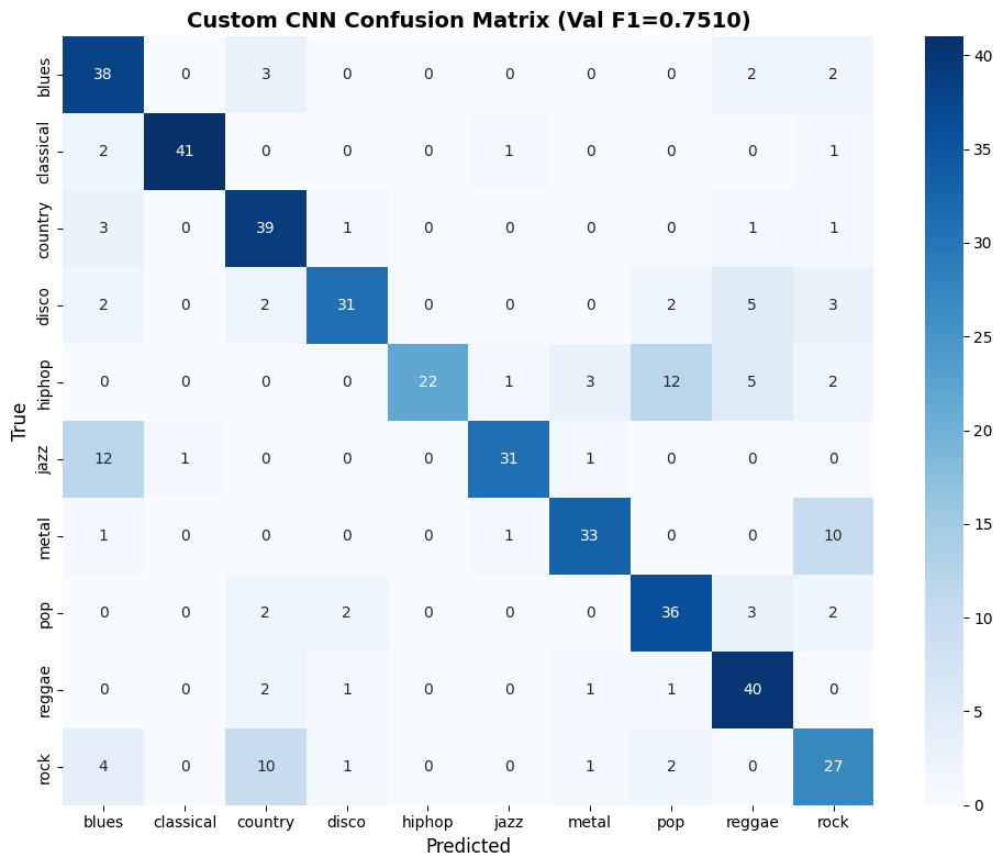
+0.06 F1 over the ML ensemble. Respectable, but not the leap I was hoping for. The network needed either more data or a head start, which is exactly what M5 would provide. But first, I wanted to try a fundamentally different way of looking at the same data.
M4: BiLSTM/GRU (0.75 F1)
The CNN treats a spectrogram as a static image. But music isn’t static, it has structure over time. A verse leads to a chorus. A drum fill signals a transition. Genre cues can be spread across the full 30-second clip.
What are LSTMs and GRUs? Both are types of Recurrent Neural Networks (RNNs) designed to process sequences, text, time series, or in our case, audio over time. Standard neural networks see all input at once; LSTMs process it step-by-step, maintaining a “memory” of what came before.
- LSTM (Long Short-Term Memory) has 4 internal gates that control what to remember and what to forget
- GRU (Gated Recurrent Unit) is a simpler variant with 2 gates, faster to train, similar performance
- Bidirectional means running the sequence in both directions (past→future and future→past), so every time step gets context from the entire clip
The LSTM/GRU models treat the spectrogram as a sequence of 1,024 time steps, each a 128-dimensional vector (the mel bins at that instant). A bidirectional LSTM processes this sequence in both directions, and a learned attention mechanism decides which time steps matter most for classification.
The attention part was what I was most curious about. In a noisy mashup, some time segments are useful (clear genre signal) and some are garbage (dominated by noise). If attention could learn to downweight the garbage, it might outperform the CNN’s uniform spatial treatment.
I trained both LSTM and GRU variants with identical settings. The learning curves:
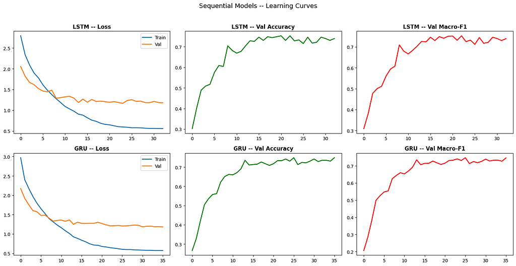
GRU trained faster per epoch (fewer gates, fewer parameters: 1.9M vs 2.5M) but ended up at essentially the same place. The LSTM squeaked ahead, 0.7531 vs 0.7474, a difference that’s probably within noise.
More interesting was the confusion matrix:
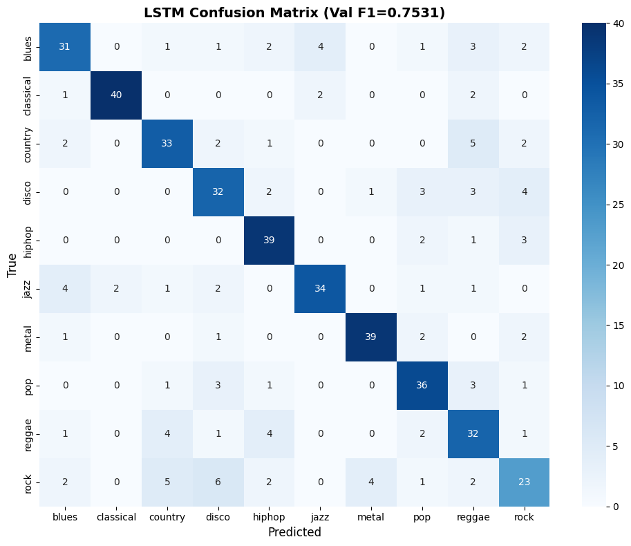
Compare this to the CNN matrix. The LSTM nails hiphop (39/45) where the CNN struggled (22/45). But the LSTM is weaker on blues (31/45 vs CNN’s 38/45). They’re making different mistakes, which is exactly what you want for ensembling. Two models that are equally accurate but disagree on different samples are more valuable together than two identical models at higher individual accuracy.
I’d hoped attention would give the sequential model an edge over the CNN. It didn’t, not on its own. But the attention weights were doing something sensible (higher attention on musically active segments, lower on noise-heavy segments), and the different error profile would prove useful later.
M5: EfficientNet-B2 (0.90 F1)
This is where the score jumped from 0.75 to 0.90. But it didn’t happen in one shot. M5 went through three iterations, and the first one was a disaster.
What’s EfficientNet? A family of CNN architectures by Google that are designed to be both accurate and computationally efficient. Instead of just making the network deeper (more layers) or wider (more filters), EfficientNet scales all three dimensions (depth, width, and input resolution) simultaneously using a principled formula. B0 is the smallest; B7 is the largest. I used B2, a good balance of capacity and speed.
EfficientNet paper. | timm library (where I loaded it from)
What’s transfer learning? Instead of training from random weights, you start with a model that was already trained on a large dataset (in this case, ImageNet, 14 million photographs). The idea is that low-level features (edges, textures, patterns) are universal and transfer across tasks. You replace the final classification layer and “fine-tune” the whole model on your data. This is massively more data-efficient than training from scratch. Transfer learning guide.
The Initial Attempt: 0.67 F1 (Worse Than LogReg)
I loaded EfficientNet-B0 pretrained on ImageNet, replaced the classification head, and fine-tuned it on 5,000 synthetic mashups with a standard train/val split. Submitted, got 0.67.
Zero point six seven. My pretrained model (ImageNet features, sophisticated architecture, compound scaling) performed worse than Logistic Regression on hand-crafted MFCCs.
I spent an uncomfortable evening staring at the config before I figured out what went wrong.
Problem 1: I’d only used 3 stems. The mashup generator in v1 loaded drums.wav, vocals.wav, and bass.wav. I’d forgotten other.wav. That’s the stem containing guitars, keyboards, strings, synths. These are the most genre-discriminative instruments. A blues track without its guitar. A classical piece without its strings. A metal song without distortion. I’d removed the soul of each genre from my training data.
Problem 2: My mashups were too clean. I’d used a conservative tempo_range=(0.9, 1.1) and gain_range=(0.5, 1.5). The real test data is messier, wider tempo shifts, more extreme volume differences. My synthetic data was an idealized version of the test distribution, and the model learned the idealization instead of the reality.
Problem 3: Single train/val split. One 85/15 split means the validation set is small and possibly unrepresentative. I was selecting the best checkpoint based on a noisy signal.
The Fix: v2 Hits 0.854
I changed four things simultaneously (I know, not great experimental hygiene, but I was running low on patience and GPU time):
- Added the 4th stem (other.wav)
- Widened tempo range to (0.8, 1.2) and gains to (0.3, 1.7)
- Switched to 5-fold stratified cross-validation
- Generated 8,000 mashups instead of 5,000
What’s K-fold cross-validation? Instead of one train/val split (which wastes data and is noisy), you divide the data into K equal parts (folds). Train on K-1 folds, validate on the remaining one. Repeat K times, each time holding out a different fold. This gives you K models and every sample gets exactly one prediction from a model that never saw it during training. Those predictions are called Out-of-Fold (OOF) predictions. Visual explainer.
The score jumped to 0.854. A +0.184 improvement from what amounted to fixing the data pipeline. I’m fairly confident the 4th stem alone accounted for roughly half of that gain.
Final Push: 0.9031
For the final version, the changes were more surgical:
- Upgraded from B0 to B2 (1280→1408 features, more capacity)
- Dropped learning rate from 3e-4 to 1e-4 (gentler with the larger backbone)
- Increased Mixup alpha from 0.3 to 0.4 (Mixup blends two training samples together, e.g., 30% blues + 70% jazz, creating virtual samples that smooth decision boundaries)
- Widened SpecAugment masks from (27,25) to (30,30)
- Added pseudo-labeling: after Round 1 training, high-confidence test predictions (>95%) were added as training data for Round 2
- Increased dropout from (0.4, 0.2) to (0.5, 0.3) to match the stronger model capacity
- Widened the classification head from 256 to 512 units
What’s pseudo-labeling? A form of semi-supervised learning. After training your model, you use it to predict labels for the unlabeled test data. The predictions it’s most confident about (>95% probability) get added back as training data with their predicted labels. It’s risky (if the model is wrong, you’re training on bad labels), but at 95%+ confidence, it’s usually right.
The pseudo-labeling was interesting. After the initial 5-fold training, around 60–70% of test samples had predictions with >95% confidence. Adding those as pseudo-labeled training data and retraining gave the model access to genuine test-distribution examples.
At inference time, each test sample got 45 predictions: 5 fold models × (1 clean + 8 SpecAugment-ed passes). All 45 softmax distributions (probability across the 10 genres) were averaged for the final prediction. This TTA (test-time augmentation) was essentially free, just forward passes, no training, and smoothed out noise-induced errors nicely.
The final OOF confusion matrix:
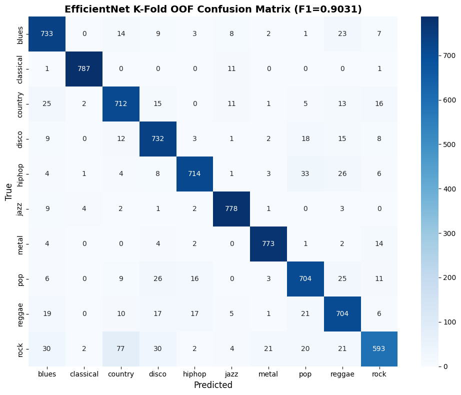
A few things to notice:
- Classical is basically solved: 787/800 correct. Its acoustic signature is so distinctive that even noise and mashup chaos can’t hide it.
- Rock is still the hardest at 593/800. It bleeds into country (77 misclassified), blues (30), and disco (30). This isn’t a model failure, rock genuinely shares instrumentation and rhythmic patterns with these genres.
- Every genre is above 700/800 correct. The model isn’t sacrificing any genre to boost others, which is exactly what Macro F1 rewards.
For the final submission, I blended the EfficientNet ensemble (85%) with the LSTM (5%), CNN (5%), and ML ensemble (5%). The weaker models contributed at the margins, a few borderline predictions got flipped in the right direction. Final score: 0.9031 Macro F1.
What Mattered Most
After building five progressively complex systems, here’s my honest assessment of what mattered, roughly ordered by impact:
The synthetic mashup generator. Without this, nothing else works. The entire competition is a domain adaptation problem disguised as a classification problem. Get the data right and a logistic regression scores 0.69. Get the data wrong and an ImageNet-pretrained EfficientNet scores 0.67.
Including all 4 stems, especially other.wav. I lost days of work by omitting the stem that carries guitars, keyboards, and strings. These are the instruments that define most genres.
Transfer learning from ImageNet. Despite being trained on photographs, EfficientNet’s early layers learn edge detectors, texture patterns, and contrast features that transfer perfectly to spectrograms. A horizontal edge in a spectrogram is a sustained note. A vertical edge is a drum hit. Repeating texture is a rhythmic pattern.
5-fold cross-validation. Five models averaging their predictions beats one model every time. Plus you get reliable OOF metrics and use 100% of your data for both training and validation.
Test-time augmentation. Averaging 45 forward passes (5 folds × 9 augmentations) per sample costs nothing but inference time and consistently improves predictions.
Mixup and SpecAugment. Both are cheap regularizers that help a lot on small datasets. SpecAugment in particular fits this problem perfectly, it trains the model to classify even when parts of the spectrogram are masked, which is what noise and interference do in practice.
Pseudo-labeling. Adding high-confidence test predictions back as training data gave the model access to real test-distribution examples. Small but measurable gain.
What didn’t matter much: the specific choice of EfficientNet variant (B0 vs B2 was marginal), fancy ensemble weighting (the 85/5/5/5 heuristic was fine), and most hyperparameter tuning (within reasonable ranges, the model wasn’t sensitive).
Version History: v1 → v2 → Final
v1 (0.67)  →  Missing other.wav + conservative augmentation + single split
    │
    │  +0.184
    ▼
v2 (0.854) →  All 4 stems + wider domain simulation + K-fold
    │
    │  +0.049
    ▼
Final (0.9031) → B2 + pseudo-labeling + stronger regularization
That first jump (0.67 to 0.854, a +0.184 improvement) came entirely from fixing the data pipeline. No architecture changes. No fancy training tricks. Just “include the right audio files” and “make the synthetic distribution match the test distribution better.”
The second jump (0.854 to 0.9031, a +0.049 improvement) came from a better backbone, pseudo-labeling, and tuning. Real but modest gains from real but modest changes.
The lesson is clear enough: the biggest bottleneck was always data quality and domain matching, not model architecture. I could have spent weeks experimenting with Vision Transformers or hybrid attention mechanisms, but a 10-minute fix to the data pipeline would have outperformed all of it.
Things I Wish I’d Done
Started with all 4 stems. This is the obvious one. The v1→v2 jump cost me multiple GPU hours and a lot of frustration, and the fix was trivial.
Run K-fold for M3 and M4 too. Only M5 got 5-fold CV. If I’d done it for the CNN and LSTM, I’d have proper OOF predictions for all models, which would make ensemble weight optimization much cleaner.
Tried the Audio Spectrogram Transformer (AST). It’s pretrained on AudioSet, 2 million audio clips. That’s a much more relevant pretraining dataset than ImageNet. I didn’t try it because Kaggle GPU time is limited and I wasn’t sure it would fit in memory, but in hindsight it was worth the experiment.
Generated more training data. The mashup generator is CPU-bound (librosa’s time-stretch is the bottleneck) but it’s embarrassingly parallel. Going from 800 to 2,000 mashups per genre might have pushed past 0.93.
Final Thoughts
The Messy Mashup competition reinforced something I keep having to re-learn: the most important code in any ML project isn’t the model definition. It’s the data pipeline. How you generate, transform, and present data to the model determines the ceiling. Architecture and training tricks determine how close you get to that ceiling.
In this case, the ceiling was set by how faithfully my synthetic mashups mimicked the real test data. When I got that wrong (v1, missing stems, conservative augmentation), a pretrained EfficientNet scored worse than Logistic Regression. When I got it right, the same architecture scored 0.90.
Every spectrogram, confusion matrix, and learning curve above tells the same story: understand your data first, match your distributions, and let the model do its job.
Final score: 0.9031 Macro F1
Try the live demo on Hugging Face →
My EfficientNet Scored Worse Than Logistic Regression, Here’s What Changed… was originally published in Towards AI on Medium, where people are continuing the conversation by highlighting and responding to this story.