
How to Make a Scatter Plot in Python With plt.scatter()

Visualizing data is a core part of analysis, and Python’s most popular plotting library is Matplotlib. To make a scatter plot, you reach for plt.scatter() from Matplotlib’s pyplot submodule, conventionally aliased as plt. You’ll use it to build both simple two-variable charts and richly customized plots that encode several variables at once.
By the end of this tutorial, you’ll understand that:
- A scatter plot is created by calling
plt.scatter()with two array-like sequences for the x and y values. - Marker size, color, shape, and transparency are controlled by the
s,c,marker, andalphaparameters. plt.scatter()enables per-point customization like variable size or color, whileplt.plot()with marker arguments runs faster for basic plots.- A single scatter plot can represent more than two variables by mapping extra dimensions to marker properties.
- Matplotlib’s plot styles, listed in
plt.style.available, are applied withplt.style.use().
To get the most out of this tutorial, you should be familiar with the fundamentals of Python programming and the basics of NumPy and its ndarray object. You don’t need to be familiar with Matplotlib to follow this tutorial, but if you’d like to learn more about the module, then check out Python Plotting With Matplotlib (Guide).
Get Your Code: Click here to download the free sample code you’ll use to build customized scatter plots in Python with plt.scatter().
Take the Quiz: Test your knowledge with our interactive “How to Make a Scatter Plot in Python With plt.scatter()” quiz. You’ll receive a score upon completion to help you track your learning progress:

Interactive Quiz
How to Make a Scatter Plot in Python With plt.scatter()
Practice using plt.scatter() in Python to create scatter plots and encode multiple variables with marker size, color, shape, and transparency.
How to Make a Scatter Plot in Python
A scatter plot is a visual representation of how two variables relate to each other. You can use scatter plots to explore the relationship between two variables, for example by looking for any correlation between them.
In this section of the tutorial, you’ll become familiar with creating basic scatter plots using Matplotlib. In later sections, you’ll learn how to further customize your plots to represent more complex data using more than two dimensions.
Getting Started With plt.scatter()
Before you can start working with plt.scatter(), you’ll need to install Matplotlib. You can do so using Python’s standard package manager, pip, by running the following command in the console:
$ python -m pip install matplotlib
Now that you have Matplotlib installed, consider the following use case. A café sells six different types of bottled orange drinks. The owner wants to understand the relationship between the price of the drinks and his daily sales, so he keeps track of how many of each drink he sells every day. You can visualize this relationship as follows:
import matplotlib.pyplot as plt

price = [2.50, 1.23, 4.02, 3.25, 5.00, 4.40]
sales_per_day = [34, 62, 49, 22, 13, 19]

plt.scatter(price, sales_per_day)
plt.show()
In this Python script, you import the pyplot submodule from Matplotlib using the alias plt. This alias is generally used by convention to shorten the module and submodule names. You then create lists with the price and average sales per day for each of the six orange drinks sold.
Finally, you create the scatter plot by using plt.scatter() with the two variables you wish to compare as input arguments. As you’re using a Python script, you also need to explicitly display the figure by using plt.show().
When you’re using an interactive environment, such as a console or a Jupyter Notebook, you don’t need to call plt.show(). All examples in this tutorial are scripts and include the call to plt.show().
Here’s the output from this code:
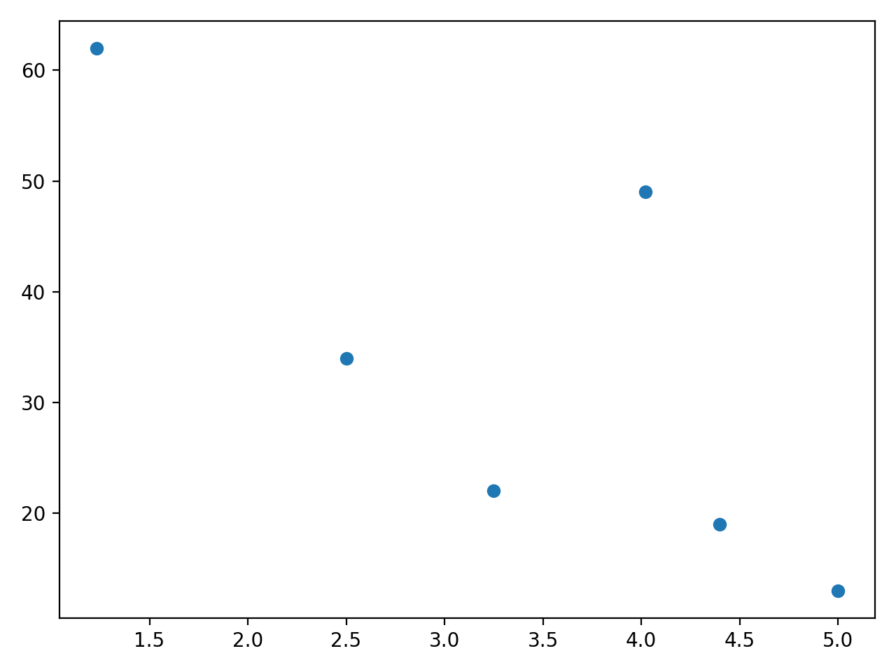
This plot shows that, in general, the more expensive a drink is, the fewer items are sold. However, the drink that costs $4.02 is an outlier, suggesting that it’s a particularly popular product. When using scatter plots in this way, close inspection can help you explore the relationship between variables. You can then carry out further analysis, whether it’s using linear regression or other techniques.
Comparing plt.scatter() and plt.plot()
You can also produce the scatter plot shown above using another function within matplotlib.pyplot. Matplotlib’s plt.plot() is a general-purpose plotting function that will allow you to create various line or marker plots.
You can achieve the same scatter plot as the one you obtained in the section above with the following call to plt.plot(), using the same data:
plt.plot(price, sales_per_day, "o")
plt.show()
In this case, you had to include the marker "o" as a third argument because otherwise, plt.plot() would plot a line graph. The plot you created with this code is identical to the plot you created earlier with plt.scatter().
Read the full article at https://realpython.com/visualizing-python-plt-scatter/ »
[ Improve Your Python With 🐍 Python Tricks 💌 – Get a short & sweet Python Trick delivered to your inbox every couple of days. >> Click here to learn more and see examples ]
