Gene Expression and Network Analysis of COVID-19–Associated Thrombosis Using the DICE Algorithm

As I briefly introduced the DICE algorithm in my previous article and its differences from traditional differential expression analysis (DEA), I will now walk through its implementation in this article. This project analyzes gene expression differences between healthy controls and COVID-19 patients with thrombotic complications using transcriptomic data from the GEO dataset GSE300129. To explore another dataset, search the GEO database for RNA-seq or microarray studies. The GEO2R tool can be used for a quick comparison between groups and to visualize significantly differentially expressed genes (adjusted p-value < 0.05). If the dataset produces very few significant genes, consider selecting a different dataset to enable effective implementation of the DICE algorithm.The goal is to identify:
- Differentially expressed genes (DEGs)
- Key regulatory genes in protein–protein interaction networks
- Enriched biological pathways related to thrombosis in severe COVID-19
The full implementation is available in the GitHub repository Gene-expression-analysis-with-KG. Only selected code snippets are included here; the complete workflow can be found in the repository.
Pipeline Overview
GEO Dataset
↓
Data Preprocessing
↓
Differential Expression Analysis
↓
Feature Selection
↓
PPI Network Construction
↓
Network Centrality Analysis (DiCE)
↓
Pathway Enrichment (GO / KEGG)
↓
Visualization
This approach enables the discovery of regulatory genes and network hubs that may be overlooked by traditional differential expression analysis alone.
Original publication of the DiCE algorithm click here.
1. Data Processing
import GEOparse
gse = GEOparse.get_GEO(geo='GSE300129', destdir='./GEO_data', silent=True)
gse.metadata
expression_matrix = gse.pivot_samples('VALUE')
print(expression_matrix.head())
GEOparse is a Python library used to download, read, and work with gene expression datasets from the NCBI GEO database (Gene Expression Omnibus).
GEO2R analysis did not identify significant genes between thrombotic and non-thrombotic COVID-19 samples. To increase statistical power, these groups were merged into a single disease cohort and compared with healthy controls. Alternatively, thrombotic vs healthy comparisons could be performed, but group imbalance must be considered.
pheno_df['merged_status'] = pheno_df['status'].replace({
    'Thrombotic': 'Disease',
    'Non_Thrombotic': 'Disease'
})
# Extract sample IDs belonging to the Disease group
disease_samples = pheno_df[
    pheno_df['merged_status'] == 'Disease'
]['sample_id'].tolist()
# Extract sample IDs belonging to the Healthy Control group
healthy_samples = pheno_df[
    pheno_df['merged_status'] == 'Healthy_Control'
]['sample_id'].tolist()
Normalization
Normalization ensures that gene expression values are comparable across samples by removing differences in scale and variability.
# Normalize the gene expression matrix using Z-score normalization
normalized_expression_matrix = expression_matrix.apply(
    lambda x: (x - x.mean()) / x.std(),
    axis=1
)
2. FEATURE SELECTION
t-test
Although the GEO2R tool allows users to download datasets filtered by adjusted p-value and log2 fold-change thresholds (>0.5), this article demonstrates how to perform the analysis programmatically. Therefore, the p-value is calculated using a t-test.
from scipy.stats import ttest_ind
p_values_list = []
for gene in normalized_expression_matrix.index:
    control_values = control_expression.loc[gene].values
    treatment_values = treatment_expression.loc[gene].values
    t_stat, p_value = ttest_ind(treatment_values, control_values, equal_var=False)
    p_values_list.append(p_value)
p_values = pd.Series(p_values_list, index=normalized_expression_matrix.index, name='p_value')
p_value_threshold = 0.05
significant_genes = p_values[p_values < p_value_threshold]
When you perform statistical tests (like t-tests) on thousands of genes, many will appear significant just by chance. This is called the multiple testing problem.
from statsmodels.stats.multitest import multipletests
reject, adj_pvals, _, _ = multipletests(
    p_values,
    alpha=0.05,           # significance threshold
    method='fdr_bh'       # Benjamini-Hochberg FDR correction
)
Information Gain
This is the most critical step in the DiCE algorithm, where it keeps only the informative genes. Information Gain (IG) is a measure of how useful a feature (e.g., a gene) is for distinguishing between classes (e.g., disease vs healthy).
from sklearn.feature_selection import mutual_info_classif
label_encoder = LabelEncoder()
y = label_encoder.fit_transform(pheno_df['merged_status'])
X = normalized_expression_matrix.loc[significant_genes_fdr.index].T
info_gain = mutual_info_classif(
    X,                     # Feature matrix: rows = samples, columns = genes
    y,                     # Target labels: Disease / Healthy
    discrete_features=False  # Gene expression values are continuous
)
Pearson Correlation
- Pearson correlation measures how similarly two genes expression levels change across samples. This reflects functional relationships between genes.
- Adds condition-specific information to PPI networks. Standard PPI networks like STRING are static. By using correlation, DiCE weights interactions based on actual expression data, making the network condition-specific , in this case disease vs. healthy.
from scipy.stats import pearsonr

# Lists to store correlation coefficients and p-values
correlations = []
p_values = []

# Compute Pearson correlation between each gene's expression and the class label (y)
for gene in X.columns:
    r, p = pearsonr(X[gene], y)  # r = correlation coefficient, p = significance
    correlations.append(r)
    p_values.append(p)

# Convert results into pandas Series with gene names as index
pearson_r_series = pd.Series(correlations, index=X.columns, name='pearson_r')
pearson_p_series = pd.Series(p_values, index=X.columns, name='p_value')
# Distance can be defined as 1 - absolute value of Pearson correlation coefficient
distance = 1 - abs(pearson_r_series)
distance.head()
3. PPI Network Construction
- The file 9606.protein.info.v12.0.txt comes from the STRING database.
- STRING provides protein–protein interaction (PPI) networks for many organisms.
- The number 9606 refers to Homo sapiens, meaning this file contains human proteins.
- This specific file (protein.info) is an annotation table for proteins in the STRING network.
df_info =pd.read_csv('9606.protein.info.v12.0.txt', sep='t', comment='!')
df_info.head()
# Read the protein links file which contains information about protein-protein interactions
df = pd.read_csv("protein_links.csv")

print(df.head())
The command print(gse.gpls.keys()) displays the platform IDs (GPL) in a GEO dataset. A platform represents the experimental technology used (e.g., microarray or sequencing). In GEOparse, gse.gpls stores platform information, and .keys() retrieves their IDs (e.g., GPL34133). This is important because the platform defines how probes map to genes, enabling correct interpretation of expression data.
platform_id = list(gse.gpls.keys())[0]
gpl = gse.gpls[platform_id]

print("Platform:", platform_id)
print(gpl.table.columns)
gpl.table.head()
The protein–protein interaction (PPI) file from the STRING database includes protein IDs, while our GEO datasets contain gene symbols. The next step is to map the gene symbols to the corresponding protein IDs before building the PPI network. Once the gene symbols are replaced with protein IDs, the dataframe containing the filtered COVID-19 genes is ready to be mapped onto the STRING PPI network to identify which genes interact with each other in our dataset.
protein_to_gene = (
    selected_gene_df
    .dropna(subset=["string_protein_id"])
    .groupby("string_protein_id")["ORF"]
    .first()
    .to_dict()
)
#Output looks like :
{'9606.ENSP00000008527': 'CRY1',
 '9606.ENSP00000011653': 'CD4',
 '9606.ENSP00000011898': 'TSPAN9',
 '9606.ENSP00000039989': 'TTC17',
 '9606.ENSP00000040877': 'TARBP1',
 '9606.ENSP00000053867': 'GRN',
 '9606.ENSP00000085219': 'CD22',
 '9606.ENSP00000166345': 'TRIP13',
 '9606.ENSP00000170564': 'GPATCH1',
 '9606.ENSP00000171757': 'P2RY10',
 '9606.ENSP00000181839': 'CDK13',
 '9606.ENSP00000187762': 'TMEM38A',
 '9606.ENSP00000194530': 'STRADB',
 '9606.ENSP00000196061': 'PLOD1',
 '9606.ENSP00000199448': 'EPDR1',
 '9606.ENSP00000200676': 'CETP',
 '9606.ENSP00000202677': 'RALGAPA2',
 '9606.ENSP00000205636': 'CMTM6',
 '9606.ENSP00000207549': 'UNC13D',
 '9606.ENSP00000209929': 'FMO2',
 '9606.ENSP00000210444': 'NANS',
 '9606.ENSP00000215531': 'SMIM24',
 '9606.ENSP00000215631': 'GADD45B',
.....
}
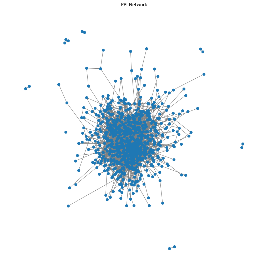
Graph Representation of Protein Interactions
This is a general graph of interacted genes in dataset, but we will build separate graphs for each group — healthy and disease — as done in the publication. While distance is used to calculate betweenness centrality, correlation is used to calculate eigenvector centrality.
#Build the graph using networkx
import networkx as nx

G = nx.Graph()  # Create an empty graph to store the protein–protein interaction network

for _, row in ppi_sub.iterrows():

    p1 = row["protein1"]
    p2 = row["protein2"]

    g1 = protein_to_gene.get(p1)
    g2 = protein_to_gene.get(p2)

    if g1 and g2:
        G.add_edge(g1, g2)  # Add an edge between two genes if their proteins interact
Top 20 genes:

PPI Network analysis of Disease and Healthy Group
G_control = nx.Graph()
G_treat = nx.Graph()

# Calculate the absolute difference in betweenness centrality between treatment and control for each gene
centrality_df["delta_bet"] = abs(
    centrality_df["bet_treat"] - centrality_df["bet_control"]
)

centrality_df["delta_eig"] = abs(
    centrality_df["eig_treat"] - centrality_df["eig_control"]
)
centrality_df.head()
Genes are ranked based on the change in betweenness centrality (Δ_bet) and eigenvector centrality (Δ_eig). The ranks are then normalized using Z-score normalization to a 0–1 scale, where 1 corresponds to the most significant change in centrality and 0 corresponds to the least. This allows us to compare the ranks across different centrality measures on a common scale. Finally, ensemble ranking is applied. Ensemble ranking is a method to combine multiple metrics (here, centrality measures) into a single score to prioritize genes that are consistently important across metrics. Multiplying ranks is a common approach; sometimes people also use averaging or other aggregation methods. The centrality DataFrame is then filtered to keep only genes that have betweenness centrality above the mean in either control or treatment, and eigenvector centrality above the mean in either control or treatment. This focuses on genes that show significant centrality in at least one condition.
# Calculate the mean betweenness centrality for control and treatment groups
mean_bet_control = centrality_df["bet_control"].mean()
mean_bet_treat = centrality_df["bet_treat"].mean()

mean_eig_control = centrality_df["eig_control"].mean()
mean_eig_treat = centrality_df["eig_treat"].mean()
4. Pathway Enrichment (GO / KEGG)
The gseapy library is used to perform gene set enrichment analysis via the Enrichr API. In this analysis, only biological process and molecular function gene sets are included to focus on the functional interpretation of the top genes identified by the DiCE algorithm. Cellular component gene sets are excluded because they often contain broad terms, such as “nucleus” or “cytoplasm,” which provide limited insight into disease mechanisms. By prioritizing biological processes and molecular functions, the analysis yields more meaningful and actionable insights into the pathways and activities altered in the disease, helping to identify potential biomarkers or therapeutic targets.
import gseapy as gp

go_results = gp.enrichr(
    gene_list = top_genes,
    organism = "Human",
    gene_sets = [
        "GO_Biological_Process_2021",
        "GO_Molecular_Function_2021"
       # "GO_Cellular_Component_2021"
    ],
    cutoff = 0.05
)
The DiCE algorithm identifies genes (dice_genes) with significant changes in centrality between disease and healthy conditions. The total number of these genes is used to assess their overlap with enriched GO terms. The overlap percentage is calculated by dividing the number of DiCE genes associated with each GO term by the total number of DiCE genes and multiplying by 100. This helps prioritize GO terms relevant to the disease-associated gene set.
n_genes = len(dice_genes)

go_results_unique["Overlap Percentage"] = (
    go_results_unique["Overlap"]
    .str.split("/")
    .str[0]
    .astype(int) / n_genes * 100
)

go_results_unique.head(50)
Apply the same steps to KEGG pathways.
kegg_results = gp.enrichr(
    gene_list = top_genes,
    organism = "Human",
    gene_sets = ["KEGG_2021_Human"],
    cutoff = 0.05
)
kegg_results_unique["Overlap Percentage"] = (
    kegg_results_unique["Overlap"]
    .str.split("/")
    .str[0]
    .astype(int) / n_genes * 100
)
5. Visualisation

The plots show how the top genes are associated with KEGG pathways and GO terms. KEGG highlights COVID-19 and thrombosis-related pathways, while GO terms remain relatively generic. Further analysis may be needed to identify more domain-specific terms. Since GO does not include COVID-specific keywords, it is expected to obtain more general GO terms, though this may vary when using different datasets.

Gene Expression and Network Analysis of COVID-19–Associated Thrombosis Using the DICE Algorithm was originally published in Towards AI on Medium, where people are continuing the conversation by highlighting and responding to this story.