
Working in a chatbox was a mistake, and Generative UI is the antidote
Missed yesterday’s post? Yeah? Tragic. That’s where I laid out the delightful little prison that cell Big Tech is building for you and it comes complete with padded walls and predictive text, and no windows. Their plan is to trap you inside their little boring AI chat window for all eternity and it doesn’t matter to them whether you’re sipping coffee in your kitchen while asking ChatGPT about your morning schedule, or that you’re trying to “do your job” by begging a chatbot to generate Q4 pipeline insights because you were too lazy to prepare.
What on earth am I talking about?
The gist is that you’re going to be fully embedded in a single input field with the emotional warmth of a parking meter that gave birth to a command line interface, and I am here suggesting to do things a tad different.
You know the one I’m talking about.
The grey rectangle with soft corners and dead eyes. A box built by researchers for researchers that is so bland it makes Notepad look like Burning Man.
And yet, we’re all in there now.
Every single one of us. Typing like it’s 1999 and praying that the Machine God understands what we mean when we say “summarize this in a corporate tone”.

But the thing is that this isn’t just about ChatGPT and other consumer grade AI anymore. The prompt-box is coming to the enterprise now, and enterprise doesn’t want to play, so I’ve been thinking for a while if there are ways to make your interaction with the AI a bit, say, sexier.
See, OpenAI didn’t just build a chatbot.
They built a cardboard box and then convinced the biggest software companies on Earth to crawl into it. And in October 2025, they launched ChatGPT Apps which are tiny integrations that let you access full platforms like Canva, Expedia, Salesforce, or whatever kind of muck you guys are running in the backend, from inside the assistant.
Not the way you’d expect though.
The 90’s spoiled you with their fat-client user interfaces with full dashboards, click paths, and rich UI. There’s even a whole industry built around it and it’s called User Experience design, UX in short cause that makes it rad (90’s slang).
But no.
You type.
It acts and thinks.
And it responds with a text blurb and a placeholder thumbnail, and if you’re lucky, maybe a scrollable card.
What used to be separate tabs, workflows, screens — those beautiful design elements are now absorbed into “The Box”.
You want to check your calendar or book a trip, review sales leads or even design a slide, you gots to type. Type type type. The assistant owns the entry point, and the sext apps live in the cardboard walls. And you, my intelligent friend, you live in the center of it all.
And it’s not only OpenAI. Microsoft’s Copilot strategy copied the “success formula” with the same move. They’re stuffing Word, Excel, PowerPoint into that same generative container. The interface becomes language.
But to be honest, the experience becomes dreadful.
And in the meanwhile, the entire enterprise world is converging on the concept of one assistant to prompt them all. I’m building one as we speak. It’s all about simplification and focus, but what it really is, is consolidation.
It’s a single pane of glass made of duct tape and laced with hallucinations.
The rationale behind it all is that instead of you having to learn five ever-changing interfaces, you now have speak to one. But it is a moody one. An assistant that decides what it wants to show, and what to hide and which tool gets the privilege of execution. And from a user point of view, this is total protocol obedience, it’s an expression of prompt-shaped power.
You think you’re using an app, but no, now you’re begging them.
Your workspace is now a living in a box with a neural network stapled to the side and the whole stack — from browsing to booking to briefing your boss — now runs through the same 700 pixel -wide coffin. And that chat window is now your desktop, your browser, and your workspace, and at home it’s also your priest, your therapist, and productivity coach.
And it’s ugly.
And if we’re being forced to live in that cardboard box, it better be sexy. It better have velvet wallpaper and laser buttons. It better do something besides stare back blankly with “How can I help you today.”
And that, dear reader, is where todays rant begins.
More rants after the messages:
- Connect with me on Linkedin
- Subscribe to TechTonic Shifts to get your daily dose of tech
- Please comment, like or clap the article. Whatever you fancy.
The original sin of ChatGPT
Let’s rewind to November 2022. OpenAI did ChatGPT onto us. It felt like magic, a miracle, and after the euphoria faded, we looked at the interface and thought “did they build this on Notepad”. One sad little box. Endless text.
Sam changed the way we compute, but forgot to fire the schmuck who designed the UI. No folders. No drag and drop. No color-coded anything. Just endless typing and scrolling that looks like the WhatsApp thread you never want to open again.
That was fine, you know, for a toy. But now that we’re supposed to work in it, like full-time, that minimalism feels like a joke we didn’t get.
So, allow me to talk UI for a second. Buttons, sliders, and other forbidden pleasures that make our apps bearable. Ever seen an AI-generated UI with real buttons? Yeah, I’m talking about sliders and dropdowns.
Man, it’s like spotting a unicorn in corporate Slack.
Buttons are not rocket science. They are basically the Lego of UX. But for years, chatbots pretended they were too good for them. “Just type” they said, “Use your words”, they said. They even created a stupid name for it “Prompting” because they didn’t want to sound old skool computer-ish by just adopting the existing word for it “Command”.
The result is that we’re stuck writing little essays to get a bloody checklist.
So now, let’s sketch what this interface should be instead, because apart from ranting about mistakes from others, I actually try to do something about it.
Say you want to shop for lingerie. Fine. No judgment. You do you.
The AI asks for preferences, but not in prose — give me a side panel with size selectors, style toggles, budget sliders, and checkboxes for comfort versus “this is a bold life choice”. Show the results in a clean grid with things like product cards, and not paragraph soup. Just add some filters you can actually touch, but not a prompt that says “describe your feeling” like it’s running a late-night dating show.

Now extend that to file management. Let me drop files into a grid on the side. Show file types, preview snippets, extraction options with a single click. Let me drag text from chat into my note-taking space. Highlight, annotate, pull into a draft, all inside one fluid screen. Don’t make me prompt for everything. Make interaction physical again. Visual and clickable and hopefully responsive.
And if I’m building something, like coding or writing a blog or a boring report, just give me live output preview, with diff compare and version rollback. Not endless word diarrhea.
An AI interface that isn’t a chat box should look like a dashboard on drugs.
It has to have a cockpit, needs to be fluid, and multi-layered, command-able (not prompt-able), and of course it comes with a floating action bar, a left panel for context, a right panel for previews, and a bottom bar for command history. The chat input becomes one of many entry points but not the altar. That’s how you make this real.

Semantic search with benefits
Ok, let’s look at this use case. Say you upload twenty documents, now you want to find the part where the CTO promised features that never shipped. In a sane world, you’d get a results view -highlighted text with source links, relevance score, snippet preview. Filters by document type, author, date. A visual map of concepts. Something that respects the fact you have a brain and deadlines.
But instead, you’re now stuck with a chat interface that vomits a flat wall of text, sometimes with a vague reference to “the second paragraph” of a document you now have to find manually. That’s not search, it’s a riddle.
Real semantic search is about interaction and not just about matching keywords. You should be able to hover over entities, see relationships, expand nodes. Get “show me more like this” right from the UI. Pin things. Compare answers side by side. Refine with a click. Chain queries into threads without losing track. Search should become a conversation with a visual memory.
And yes, we have the tech. What we don’t have is the will to integrate it into the dog gone interface.
Take a look at the interface below . . .

This is what semantic search looks like when it finally grows up and moves out of the chatbox.
The screen is split into purpose.
On the left, you get a control spine. Filters live there permanently instead of being retyped like long winded prayers. Document type, author, date range, source, confidence score are all visible at once. You refine by clicking and you won’t have to explain yourself again. Every filter change updates results immediately, so the system reacts at human speed instead of conversational speed.
In the center, each hit is a card with a highlighted snippet, clear source reference, relevance indicator, and quick actions. Preview, pin, compare, open in context. You see exactly where the claim lives and why it surfaced. The system respects the fact that you are looking for receipts.
Hovering over a result reveals entity highlights. Names, features, dates light up as anchors. Click one and related passages across other documents surface instantly. This turns search into navigation rather than excavation.
Below that, pinned results live as a working set. You collect evidence as you go. Two clicks and you compare claims side by side. Differences highlight automatically. Contradictions stand out without the assistant narrating them like a bedtime story.
And at the bottom, query history is a structured thread. Each step shows what changed. Filters are added and concepts can be expanded. You can jump back to any state without rephrasing anything.
The AI is present, but it behaves like an analyst, and not a chatterbox. It suggests refinements as affordances. “More like this” appears as a button. “Expand related concepts” appears as a toggle. Guidance exists, but it never hijacks the screen.
This interface does one crucial thing that chat never could. It externalizes thought. You are not forced to hold context in your head while parsing paragraphs of generated text. The system shows structure, relationships, and provenance all at once.
Mood boards for AI conversations
Why is the AI chat window still a barren wasteland. Why does every response look like a tax form. Where’s the chutzpah!
If we’re building strategies, give me layout options. Let me switch between text view and board view. Let me drop in images, quotes, mind maps. Let me theme my workspace like a digital war room.
Don’t show me friggin’ markdown like it’s a gift. Show me a canvas. Editable, movable, persistent. One section for research. One for ideas. One for actions. Let the assistant sit in the corner and annotate, not dominate the entire screen with lorem ipsum.
And for the love of everything sacred — let me collapse messages. Let me pin the good bits. Let me organize the chaos.
Make it a mood board. Make it mine.

What this interface does is brutally simple and quietly revolutionary.
It takes the AI out of the role of chatty novelist and puts it into the role of spatial assistant. The screen becomes a working surface, not a transcript.
What it does
You get a board that behaves like a digital war room. Research lives as cards. Ideas live as sticky notes and clusters. Actions live as tasks and checklists. The center space is a canvas where you can move things around, group them, label them, and keep them visible. The assistant sits on the side and annotates your work instead of flooding your screen with paragraphs.
The interface gives you two modes you can flip between without losing state.
Text View is for reading and writing when you actually want prose.
Board View is for thinking with your eyes, arranging concepts, and building structure without typing a thesis.
This matters because most “AI conversations” are not conversations. They are messy thinking sessions. The interface turns the messy thinking into visible structure.
Why it is so effective
It makes a few things happen that a normal chat window refuses to do.
It externalizes memory. You can see what matters without scrolling. You pin the good parts. You collapse the noise. You keep the best fragments present while you work. That reduces cognitive load hard. Your brain stops acting like the RAM for an assistant with amnesia.
Then it turns refinement into interaction because you drag an idea under a different header, cluster it with another theme, or attach a screenshot to it. Your hands do the meaning making. The AI follows your structure rather than inventing its own structure every time. And it makes the assistant less dominant because it becomes a side panel that suggests, summarizes, and highlights. You remain the editor. The assistant becomes a collaborator that comments and proposes instead of controlling the narrative.
The result feels fast because you are not trapped in a linear thread. You move around a space. You build a shape. You can stop reading and still keep progressing.

Google Mixboard is an interesting experiment because it attacks the same problem from the other side. Your interface is a mood-board workflow with an AI assistant inside it. The primary object is the board. The assistant supports it. Mixboard is a concepting board that uses generative AI to help you explore, expand, and refine ideas on an open canvas. It is built to generate and remix visuals and text for ideation, with a template or blank canvas approach.
Its superpower is visual variation and when you prompt a theme, it fills the board with related images and concepts. You can regenerate, ask for more like this, and iterate quickly. This kind of interface is helping you structure thinking across research, ideas, and actions in one place, then making the AI serve that structure.
Mixboard leans heavily into generative media. It is a generator-first product, this means that it is designed around the act of generating content as the primary interaction, not around organizing, editing, or executing work.
The board-first UI I created above is an organizer-first product.
Both are “chat alternatives,” but they optimize for different phases.
Mixboard is strongest in the early ideation stage where you want breadth, mood, style, exploration. The UI above is strongest in the synthesis stage where you want structure, decisions, and execution. I think mixboard is an interesting experiment because it proves a core point of this article that the chatbox is not inevitable, but it is a default. The same thing goes for one of their other experiments, NotebookLM.
Zeta Alpha and other B2B kink dungeons
Let’s talk about Zeta Alpha. This isn’t some hipster SaaS app with rounded buttons and dopamine drip type UI, it is meant for research but nonetheless you can play with it yourself. And even though they have been around for a couple of years, they had the chutzpah I talked about earlier to experiment with an AI based user interface.
The guys behind Zeta Alpha took a long hard look at the average AI interface and decided “our customers ain’t mediocre, so we won’t build mediocre stuff either”.
What they built is brutal.
A multi-pane, context-rich, citation-heavy semantic war machine.
Left panel: your source documents, fully indexed, scrollable, highlightable.
Middle: your queries, your threads, your agent.
Right: your insights, auto-saved, linkable, exportable. Add search overlays, semantic clusters, author disambiguation, time filters.

But it’s not for everyone.
Throw this UI at Harry, Dick, and Tom in the back of their shed and they’ll stare like you just handed them a cockpit manual for a space shuttle. This beast assumes domain knowledge and it expects information literacy, and above all, it dares you to think.
And maybe that’s the point.
Because between the beige box of ChatGPT and the black-ops interface of Zeta Alpha, there lies a middle ground. A sweet spot. Where normal people can work like researchers, without being crushed by dropdowns. Where AI organizes, visualizes, remembers, and respects your time.
Zeta Alpha shows what happens when you treat information like a system instead of a stream. When you assume the user isn’t an idiot, and when you build for depth, not for better model-demos.
Every consumer AI app should steal their homework.
Strip it down, soften the blow, but keep the bones. Build an interface that scales with skill. One that starts simple, but unfolds with layers, views and options.
Make the UI learn with the user, not condescend to them. Because if we’re going to live in the assistant, then for the love of god, give us a cockpit, not a confessional.
But we’re not there yet, people, there’s one question left to think about.
How are we going to build this?
Will every use case require a pre-built structure like Zeta Alpha’s or NotebookLM or Mixboard?
The answer is no.
Because the future is here.
And it is called . . .
Generative UI
The hardware and interface model that makes this sexy box possible. I wrote extensively about it a half year back, and if you want to catch up, read Is generative UI the buzzword that snuffs designers? — and if you want the gist, just stick around.
Everyone keeps yelling about new chat interfaces like the main problem is font choice and rounded corners but the real problem sits deeper. The chatbox became dominant because it was the cheapest interface that could ship fast while the model lived somewhere else, on a server farm, behind a latency tax. That thin client life forced everything into one cardboard rectangle, and we all pretended it was elegant minimalism instead of a budget constraint wearing a turtleneck.
But Generative UI is the escape hatch, and AI PCs are the engine.
Together they turn the interface from a fixed layout into a living system that rearranges itself around intent, context, and timing, and that move only works when the compute no longer lives far away.
Your average chat window can only do two tricks. It can take text. It can output text. Sometimes it throws in a little card as a treat, like a dog that sat on command. Generative UI treats the screen as something that can be composed on the fly, built from parts, and reassembled in response to what you do. The interface becomes a shapeshifter, and the model becomes the stage manager. Generative UI reshapes itself based on your behavior and the app context, and it even tries to predict what comes next.
The core idea is blunt. Static UI serves content. Generative UI serves intent. That single sentence is the whole war we have to win.
Static UI says, here are menus, go hunt. Generative UI says, I saw what you do at 7:23 AM and I know you want the same thing again, so I’ll surface it before you go digging through three levels of corporate navigation. It is the interface acting like it knows you, and yes that is helpful, and yes that is also kinda creepy.
Under the hood, Generative UI runs on a feedback loop where every click, hover, hesitation, and detour becomes a signal. Those signals become insights and those insights trigger interface changes which in turn alter what you do next.
But the thing is that a real Generative UI experience cannot be delivered as a single chat thread. It needs components, it needs surfaces and spatial memory and a way to show you options without forcing you to write a small novel every time you want to filter a list.
Instead of designing one screen for one task, you build a library of UI pieces. Date pickers. Toggles. Range sliders. Preview cards. Comparison tables. Citation blocks. Action bars. Confirm dialogs. Progress timelines. Result grids. The AI chooses from that library based on your intent and what it sees you doing. It assembles a screen the way Lego bricks assemble into a thing you can actually use, then it rearranges the bricks when the situation changes.

That is the interface as generation, not the interface as layout.
Then the ugly engineering reality shows up, because this system has to react fast. Interfaces need to react within 100 to 200 milliseconds, and that includes behavior analysis, component selection, layout optimization, and rendering, and when you get that wrong, the interface feels sluggish, and the user feels like the system is thinking about moving a button while they are trying to do their job.
Say you want lingerie (again). The interface renders sizes, styles, budget sliders, comfort toggles, delivery speed, brand preferences, and a preview grid. You can click, refine, compare, and save. The assistant stays present, but it no longer forces you to write a paragraph just to narrow color choices. You get a living UI that reacts to your behavior.

You say you want to review a contract. The interface renders the contract view with highlighted terms, a risk panel, a clause index, and an action bar for rewriting sections. You can click the termination clause and see its dependencies. You can adjust thresholds and see suggestions update instantly. The assistant becomes an orchestrator of components rather than an author of endless text.
This is the sexy box you want — also without lingerie — and it will only happens when the system can generate UI in real time, with low latency, with predictable component libraries, and with compute close enough to react quickly.

Now comes the catch.
Performance can kill the whole thing. If the AI takes three seconds to decide where a button belongs, the user could have finished the task manually. Design consistency can become a nightmare when the AI makes autonomous aesthetic decisions, since brand guidelines were written for static interfaces, not for screens that shape-shift.
Generative UI needs standards
Here’s where things get interesting.
People love talking about Generative UI as if it’s just a clever frontend trick, but it isn’t. Once agents start returning UI instead of text, you need protocols because otherwise it would become a bloody mess.
And I don’t mean marketing frameworks, but actual specs.
We already know some of the plumbing in agent-land
- MCP (Model Context Protocol) — A way for models to discover tools, data, and actions. With MCP you can get information from a backend system for instance.
- A2A (Agent-to-Agent) — Protocols that allow agents to coordinate, delegate, and exchange structured tasks.
- AP2 / Agent Payment Protocol -Focused on enabling agents to complete transactions and payments safely.
- UCP (Universal Commerce Protocol) Google’s attempt to standardize how agents discover products, build carts, link identities, and execute checkout across systems. It’s commerce infrastructure for agents, not humans.

And here’s the important bit.
None of those define UI — they define capabilities. To make Generative UI real, agents need a way to return structured, renderable interface components, not just words.
That’s where a new class of specs has started to appear, and as usual, Google is setting the de facto standard for it.
Several specs now exist that allow agents to return declarative UI, not prose.
A few worth knowing:
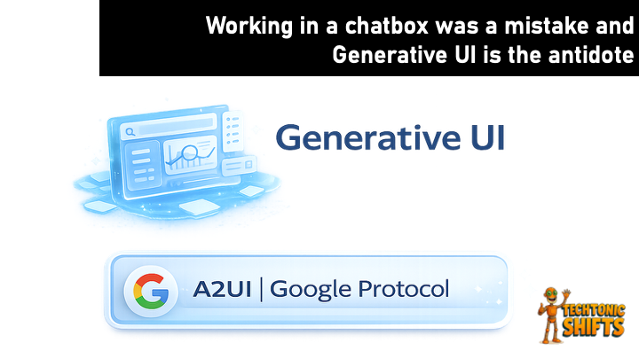
- A2UI (Google) — A declarative, model-friendly Generative UI format. Streaming, JSON-based, and platform-agnostic. Designed so agents can describe what should be rendered without caring how.
- Open-JSON-UI (OpenAI) — An open version of OpenAI’s internal UI schema. Focused on standardizing how UI components are described declaratively.
- MCP-UI (Microsoft + Shopify) — An extension of MCP that allows user-facing UI to be returned, often iframe-based, and tightly integrated with commerce and business workflows.
These specs let agents return dynamic UI components, and then there’s AG-UI.
Despite the name, AG-UI is not a Generative UI spec, but a user interaction protocol. It is the runtime bridge between agent and application and it handles state, events, updates, and feedback loops.
Crucially, it can carry any of the generative UI formats above. AG-UI doesn’t decide how the UI looks but it decides how the conversation between agent and interface stays alive, and that distinction matters, because Generative UI specs describe what to render, and AG-UI describes how interaction continues, and when you put them together and you get something dangerous.
But in a good way.

The real thing
Now, the box is finally starting to crack. When agents can return UI declaratively, when the runtime can handle bidirectional interaction, and when the hardware can react instantly, the interface can now be assembled, constrained by policy, and rendered in real time.
Assembled from known parts, I mean.
For designers this means they will have to adapt to designing systems, components, and guardrails and in the end they get to assemble the house. And yes, this will make designers uncomfortable because it will increase complexity and it will probably surface new failure modes.
But the alternative is living forever in a 700-pixel-wide confession booth, typing like it’s 1999, and pad ourselves on the back that we’re designing the future of work.
Signing off,
Marco
I build AI by day and warn about it by night. I call it job security. Big Tech keeps inflating its promises, and I just bring the pins and clean up the mess.
Think a friend would enjoy this too? Share the newsletter and let them join the conversation. LinkedIn, Google and the AI engines appreciates your likes by making my articles available to more readers.
Working in a chatbox was a mistake, and Generative UI is the antidote was originally published in Towards AI on Medium, where people are continuing the conversation by highlighting and responding to this story.