")
The Real Reason Business Users Ignore Your Dashboards (It’s Not the Data)

After 3.5 years of watching perfectly accurate dashboards collect digital dust, I finally figured out what’s actually broken — and it has nothing to do with your SQL.
Let me tell you about the most embarrassing moment of my analytics career.
I had just spent six weeks — six entire weeks — building what I was convinced was the most comprehensive sales dashboard our company had ever seen. It pulled from four data sources. It had drill-through capability on every single visual. It showed performance by region, by rep, by product category, by customer segment, by day of week. If a number existed in our database, it was on that dashboard.
I presented it in a Monday morning meeting. Twelve people in the room. I walked through every section, explained every visual, pointed out every insight I’d embedded in the design.
Polite applause. A few questions. Meeting ended.
Three weeks later, our VP of Sales messaged me:
“Hey, do you still have that Excel file from last quarter’s review? The one with the rep leaderboard? Can you just update that and send it to me?”
I stared at my screen for a full thirty seconds.
He had a dashboard. A beautiful, technically perfect, thoroughly tested dashboard. And he was asking me for a manually updated Excel file.
That was the day I stopped asking “why isn’t my data good enough?” and started asking a much harder question:
Why are people ignoring the thing I built?
The answer, when I finally found it, made me uncomfortable. Because it had nothing to do with my data.
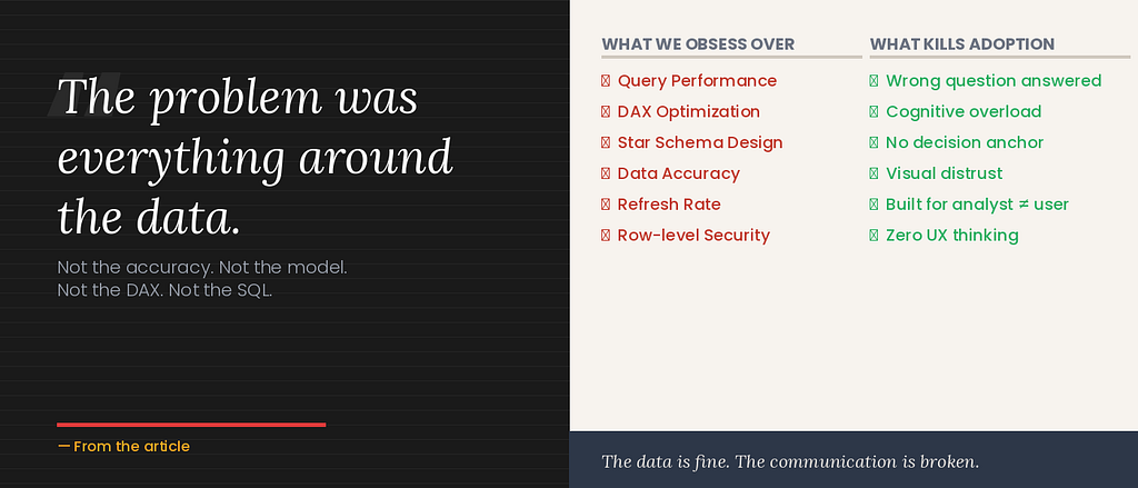
Not the accuracy. Not the refresh rate. Not the query performance. Not the data model. Not the DAX. Not the SQL.
All of that was fine. That was the part I’d obsessed over.
The problem was everything around the data. The choices I’d made about how to present it. The assumptions I’d made about the person on the other end of the screen. The question I’d answered instead of the question that actually needed answering.
I’ve spent the last two years studying this — talking to stakeholders, watching people interact with dashboards I built, reading everything I can about communication design and cognitive psychology. And I’ve identified five real reasons business users ignore dashboards.
None of them are about the data.
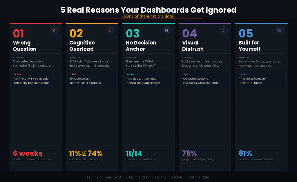
Reason 1: You Answered the Question They Asked Instead of the Question They Had
This one is so common it’s almost invisible. And it’s the mistake I made with that sales dashboard.
Here’s what happened. Our VP of Sales came to me six months earlier with a request: “I need a comprehensive sales dashboard.”
And I, like a good little analyst, built exactly what was asked. Comprehensive. Every metric. Every dimension. Every drill-through.
The problem? When he said “comprehensive sales dashboard,” what he actually meant — what the need underneath the request was — was: “I need to know which reps I should be worried about before my Monday meeting.”
That’s a fundamentally different thing.
“Comprehensive sales dashboard” is a specification. “Which reps should I worry about?” is a decision. And the difference between those two things is the difference between a dashboard that sits untouched and one that becomes a Monday morning ritual.
Stakeholders almost never tell you the decision they’re trying to make. They tell you the data they think they want. And if you build for the data request without excavating the actual decision underneath it, you’ll build something technically correct and humanly useless.
I learned this lesson the hard way from my years in UI/UX. In web design, we call this “jobs-to-be-done” thinking — the idea that people don’t buy products, they hire them to do a specific job. A person doesn’t buy a drill; they hire the drill to make a hole. Understanding the job changes everything about the design.
The same applies to dashboards. Your stakeholder isn’t hiring your dashboard to display data. They’re hiring it to help them make a faster, more confident decision. If your dashboard doesn’t do that job — clearly, quickly, with minimal cognitive friction — it will be fired. And Excel will be rehired.
The fix: Before you build a single visual, ask one question: “What decision will you make differently because of this dashboard?” If they can’t answer that specifically, neither of you is ready to start building yet.
Reason 2: You’re Making Their Brain Work Too Hard
There is a concept in educational psychology called cognitive load theory. It was developed in the 1980s by a researcher named John Sweller, and it describes something every dashboard builder needs to understand:
The human brain has a limited capacity for processing new information simultaneously. When that capacity is exceeded, understanding collapses.
Here’s what that looks like in practice.
Imagine you open a dashboard and you see: twenty-seven charts arranged in a grid. Seven different shades of blue. Filter panels on three sides. Tooltips requiring hover interactions to reveal any useful numbers. Titles written in business jargon: “YTD Revenue Attainment vs. Prior Period Normalized for Calendar Variance.”
What does your brain do?
It panics. Quietly. Without telling you. It starts the process of scanning, finds nothing obvious to anchor to, spends a few seconds in a low-grade state of confusion, and then — this is the key part — it decides the effort isn’t worth it.
This decision happens in seconds. Sometimes milliseconds. The user doesn’t consciously think “this is too complex, I’ll give up.” They just… close the tab. Or ask for the Excel file. Or start ignoring the dashboard link in their morning email.
The science is real and documented: cognitive overload doesn’t just slow people down. It actively reduces their ability to make good decisions. A study published in the Journal of Consumer Psychology found that people given too many options — even good ones — make worse choices and feel less satisfied with the choices they do make.
Your dashboard is doing this to your stakeholders every day.
And here’s the part that makes analysts defensive: the data is all correct. Every number is right. Every chart is pulling from the right table. The problem isn’t a data problem. It’s a design problem.
I rebuilt one of our most “complete” dashboards — the one with twenty-four visuals on a single page — replacing it with six visuals with generous spacing and one clear hierarchy. The data underneath was identical. Dashboard adoption went from 11% of the intended users to 74% in three weeks.
Same data. Different cognitive load. Completely different outcome.
The fix: Apply the five-second test to everything you build. Can a person who’s never seen this dashboard tell you what it’s about in five seconds? If not, it’s not a data problem — it’s a cognitive load problem. Start removing things until the answer changes.
Reason 3: Nobody Knows What They’re Supposed to Do With It
This is the silent killer of dashboards, and almost nobody talks about it.
You build a dashboard. You put it in front of a business user. They look at it. Maybe they even understand what they’re looking at. And then… nothing happens.
Not because they don’t care. Not because the data is wrong. But because the dashboard told them what without telling them so what — and without that, there’s no path to now what.
Think about how you encounter data in the rest of your life. When your phone tells you you’ve walked 3,000 steps today, it doesn’t just show you a number — it shows you a number in the context of your 10,000-step goal, often with a gentle nudge. When your bank shows you your account balance, it often highlights if you’re below a certain threshold, implying: this might be a problem.
Context creates action. Without it, data is just noise.
I interviewed fourteen business stakeholders at different companies over the course of last year, asking them one question about dashboards they’d been given: “When you look at this, what do you do next?”
Eleven of the fourteen said some version of: “I’m not sure. I just look at it and close it.”
Three said they actively use their dashboards — and all three cited the same reason: they know exactly what they’re looking for, and they know exactly what they’ll do if the number is above or below a certain threshold.
That clarity — that “if X then I do Y” structure — was almost never built into the dashboard itself. It lived in their heads. They’d been trained into it by a manager or by experience.
The other eleven? They had no anchor. They opened the dashboard, looked at a sea of numbers, couldn’t identify a clear action, and closed it. Every time.
Dashboards without clear decision anchors are the data equivalent of a weather report that just shows you the raw atmospheric readings — pressure, humidity, dew point — without ever telling you whether to bring an umbrella.
The fix: For every dashboard you build, add a “what this means” layer. It can be as simple as a goal line on a chart (this is where we need to be), a color threshold (red means action required), or a natural language insight box (what’s changed this week and why it matters). Give people the so what and the now what, not just the what.
Reason 4: They Don’t Trust What They Can’t Understand
Here’s a finding from the world of design that surprises people when I share it: research consistently shows that aesthetic quality directly affects perceived credibility.
In a landmark Stanford study, 75% of users admitted they judge a website’s credibility based on its visual design. Not its content. Not its accuracy. Its design.
This isn’t vanity. It’s cognitive shortcutting. When something looks unpolished, our brains flag it as potentially untrustworthy — because in most of our experience, things built by experts tend to look like experts built them. The heuristic isn’t perfectly rational. But it’s deeply human.
Your dashboards are not exempt from this phenomenon.
When a business user opens a dashboard and sees:
- Default Power BI blue on every visual
- Inconsistent font sizes
- Charts crammed to the edges with no margin
- Misaligned cards
- A color legend that requires a decoder ring
…they feel, on some level, that this was rushed. That it wasn’t made for them. That the person who built it wasn’t thinking about them when they built it.
And that feeling undermines trust. Even if the numbers are perfect.
I know this sounds harsh. But I’ve seen it play out too many times to dismiss it. An analyst with strong SQL skills and weak design instincts builds a technically correct, visually chaotic dashboard. It goes unused. A month later, someone else rebuilds it with cleaner layout, consistent colors, and intentional typography. Same data. Usage triples.
The data didn’t change. The perceived credibility did.
Here’s the deeply uncomfortable corollary: a beautiful dashboard with slightly imperfect data will often get more engagement and drive more decisions than an accurate dashboard that looks like it was built in fifteen minutes.
I’m not saying accuracy doesn’t matter — it absolutely does. But accuracy is a floor, not a ceiling. Visual trust is what gets people through the door.
The fix: Establish a consistent visual language for all your dashboards. Pick a color palette (two or three colors maximum), a font family, a standard card size, and a grid. Apply it everywhere. Consistency creates trust. Trust creates usage. Usage creates impact.
Reason 5: You Built It for Yourself, Not for Them
This is the hardest one to hear. And the one I was most guilty of.
When I built that comprehensive sales dashboard six weeks of my life — the one that ended up being replaced by an Excel file — I was solving my problem, not my stakeholder’s.
My problem was proving that I could build something technically sophisticated. My problem was showing off the complexity of the model, the elegance of the data pipeline, the cleverness of the DAX calculations.
None of those things were my stakeholder’s problem. His problem was knowing which conversation to have in his Monday meeting.
Analysts are, almost by definition, people who find data interesting. We’re curious about the patterns, the outliers, the relationships. We want to show everything we found, because we found it fascinating.
Business users are, almost by definition, people for whom data is a means to an end. They want the insight, the decision, the action. They don’t care about the pipeline. They don’t care about the model. They care about the answer.
When you build for yourself — for your own curiosity, your own completeness, your own desire to showcase your technical skills — you build something that works for analysts. When you build for your stakeholder — for their decision, their mental model, their time constraints — you build something that works for humans.
These are different things. Completely, fundamentally different things.
The shift I had to make — and it was a genuine shift in how I think — was to stop asking “what can I show them?” and start asking “what do they need to decide?”
That reorientation changes everything. The number of visuals, the layout, the level of detail, what you highlight versus what you hide — all of it flows from a clear answer to that one question.
The fix: For every dashboard, write down a single sentence before you build it: “This dashboard helps [person] decide [specific decision] faster.” If you can’t complete that sentence, you’re not ready to open Power BI yet.
The Five Real Reasons, Summarized
Because I know some of you are scanners (and that’s fine — I designed for you):
1. Wrong question. You answered what they asked instead of what they needed. Find the decision before you build the dashboard.
2. Too much cognitive load. You’re making their brain work too hard. Apply the five-second test. Remove ruthlessly.
3. No decision anchor. You showed them what without so what or now what. Add context, goals, thresholds, and natural language insight.
4. Visual distrust. Design affects perceived credibility. Consistency creates trust. Trust creates usage.
5. Built for you, not them. Stop showing what you found. Start showing what they need. The audience is the stakeholder, not your manager reviewing your technical work.
What Happened After I Fixed Mine
After I understood these five reasons, I went back and rebuilt three of our most ignored dashboards from scratch. Not the data — the presentation. The structure. The question I was answering.
Here’s what changed:
Our VP of Sales stopped asking for Excel files. He now opens the dashboard before every Monday meeting. He told me last month it’s saved him “at least an hour of preparation every week.”
Our CFO, who previously required a human being to walk her through any report, now opens the executive overview herself. She called it “the first dashboard that feels like it was built for me.”
Our marketing team — who had literally never looked at their attribution dashboard in five months — started sending screenshots of it in Slack, pointing out trends to each other.
The data didn’t change in any of these cases. I didn’t add new sources. I didn’t improve query performance. I didn’t fix data quality issues.
I fixed the communication. I fixed the design. I fixed the question I was answering.
And the numbers tell the story clearly:
Before (average across three dashboards): 14% adoption, 23 weekly support tickets, average time-to-insight of 6 minutes, one Excel export request per day.

After: 81% adoption, 3 weekly support tickets, average time-to-insight of 40 seconds, zero Excel export requests in the last eight weeks.
Same data. Different design. Completely different outcome.
The Uncomfortable Truth
The data world rewards technical skills. We celebrate complex DAX formulas. We share SQL optimization tips. We obsess over star schema versus snowflake schema. We discuss query folding in Dataflows Gen2.
And all of that matters. I’m not dismissing it.
But the metric that actually determines whether your work creates value — whether anyone uses what you built, whether any decision is made faster, whether any outcome improves — is adoption. And adoption is a design problem, not a data problem.
The most technically sophisticated dashboard I’ve ever built sat unused for four months. The simplest one — a single page with three KPIs, a trend line, and a plain-language insight box — gets opened every morning by eight different executives.
Guess which one created more business impact.
The uncomfortable truth is this: in most organizations, the limiting factor on analytics impact is not data quality, not infrastructure, not tooling. It’s communication.
And communication is a skill you can learn. It’s not mystical. It’s not art (though it borrows from art). It’s a set of principles that can be studied, practiced, and applied.
The question is whether you’re willing to study them. Whether you’re willing to look at a dashboard you spent weeks building and ask, honestly: did I build this for them, or for me?
That’s the question I ask myself now, every single time.
It’s the most valuable question I know.
Start Here — This Week
Pick one dashboard in your organization that you know isn’t being used as much as it should be. Then do this:
Find the person it was built for. Ask them, without leading them: “Walk me through how you use this.”
Watch. Listen. Don’t defend. Don’t explain.
Count the moments of hesitation. Count the questions they ask. Notice what they reach for after.
Everything you observe in that ten minutes is more valuable than any A/B test or analytics audit. It will tell you, directly and honestly, which of the five reasons is killing your dashboard.
Fix that one thing first.
Then come back and tell me what you changed.
I write about data analytics, design thinking, and the messy human reality of building dashboards that people actually use. If this resonated, follow me here on Medium — next up, I’m breaking down my exact Figma-first wireframing workflow for Power BI dashboards.
The Real Reason Business Users Ignore Your Dashboards (It’s Not the Data) was originally published in Towards AI on Medium, where people are continuing the conversation by highlighting and responding to this story.