
Hypothesis Testing Is Just a Courtroom With Worse Snacks

Hypothesis Testing Explained for Beginners
Nobody faked the data. One little number did all the lying, and it’s the same number deciding what you read, buy, and swallow
In the spring of 2015, newspapers across twenty countries told their readers that chocolate helps you lose weight.
This wasn’t a tabloid rumor. There was a real study behind it. Real volunteers ate real chocolate, real scientists took real measurements, and the result was statistically significant, which is science’s way of stamping a finding as legit. Germany’s biggest newspaper ran it on the front page. TV shows picked it up. Somewhere, someone’s aunt forwarded it to the family group chat, and honestly, who could blame her.
Every number in that study was genuine. And the whole thing was a trap.
A journalist named John Bohannon designed it on purpose to be garbage, published it, and then sat back to watch the world’s media eat it up. He later wrote a confession titled, roughly, I fooled millions of people into thinking chocolate helps weight loss.
Here’s what I need you to sit with. He didn’t fake anything. No invented patients, no doctored spreadsheets. The lie was hiding inside one legitimate statistical number, used in a sneaky way.
By the end of this article, you’ll know exactly how the trick works, because you’ll understand the number. It’s called a p-value, and it quietly runs the modern world, drug approvals, election polls, the “9 out of 10 dentists” ads, and every A/B test behind every app on your phone.
I’ll show you the trick. But first you need to see the machine.

Statistics is one question wearing a lab coat
Forget formulas for a minute. Here’s a scene you already know.
You’re playing Ludo, or Monopoly, whatever your family fights over. Your cousin needs a six to win. He rolls a six. Fine. He needs another one. Six again. Then again.
Three sixes.
Notice what your brain just did. It didn’t run any math, but it knew something. It knew that three sixes in a row is possible with a fair die, but suspicious. One six raises nothing. Ten sixes and the dice are going out the window. Somewhere between “sure, luck” and “you’re a cheat” your brain has a line.
Congratulations, that’s hypothesis testing. The entire terrifying subject is your dice suspicion, written down carefully so we can use it on medicine and money instead of board games. Every test you’ll ever meet, no matter how scary its name, is asking one question.
Could this just be luck?
The new drug group recovered faster. Could be luck. The new website design got more signups. Could be luck. Your cousin rolled three sixes. Could be luck. Statistics is the machinery that turns “hmm, could be luck” into an actual number, so that two people can argue about evidence instead of vibes.
That’s the whole subject. Everything from here is just details, and I promise to introduce each one like a person, not a formula.
A woman, a cup of tea, and the birth of the machine
The machinery got invented because of tea. Genuinely.
Cambridge, England, in the 1920s. At an afternoon tea, a scientist named Muriel Bristol turned down a cup because the milk had been poured in after the tea. She insisted milk-first tastes different, and she could tell.
A colleague named Ronald Fisher decided this claim needed to be tested, on the spot, like a menace. He prepared eight cups behind her back, four milk-first, four tea-first, shuffled the order, and asked her to sort them.
Here’s Fisher’s reasoning, and it’s the reasoning inside every clinical trial today. Suppose she can’t actually taste the difference and is purely guessing. Out of all 70 possible ways to sort those eight cups, only one is perfectly correct. So a pure guesser nails it about 1.4% of the time. If she gets them all right anyway, either something rarer than 1-in-70 just happened, or her tongue is telling the truth.
She got all eight.
Fisher went on to turn that afternoon’s logic into the formal method in his books, and the structure has not changed since. Assume the boring explanation. Work out how surprising your result would be if boring were true. Let the level of surprise make the call.

The two suspects in every investigation
Modern statistics runs Fisher’s logic with formal names. Every test starts by writing down two rival explanations of the world.
The null hypothesis (written H₀, said “H-nought”) is the boring one. Nothing is happening. The die is fair. Bristol is guessing. Chocolate does nothing. Whatever pattern you spotted is luck in a costume.
The alternative hypothesis (H₁) is the interesting one. Something real is going on.
And now the rule that feels backwards on day one and brilliant by day three. You never try to prove the interesting one. You put the boring one on trial and check whether your evidence embarrasses it badly enough to reject it.
Why so twisted? Because “prove my exciting idea” is a rigged game. Randomness produces patterns constantly, and a motivated human can find “evidence” for nearly anything in a big enough pile of numbers. Attacking your own boring explanation first is a bias-removal machine.
A courtroom runs on the identical principle, and the parallel is so exact it’s almost spooky. The defendant is presumed innocent, that’s the null hypothesis. The prosecution presents evidence, that’s your data. The jury asks whether the evidence could plausibly exist if he were innocent, that’s the p-value we’re about to meet. And the verdict comes in two flavors, guilty or not guilty. Courts never declare anyone “innocent,” because failing to prove guilt is not the same as proving innocence. Statistics borrowed that too. We say we fail to reject the null. We never say we proved it.
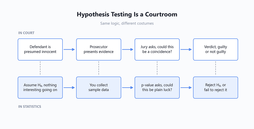
Keep that “not guilty vs innocent” distinction in your pocket. It’s the single most common thing beginners get wrong, and knowing it already puts you ahead of a lot of published research.
Meet the p-value, the most misquoted number on Earth
My friend claims he can feel which way a coin will land before it does. We tested this. He called 8 out of 10 flips correctly and has mentioned it at every gathering since.
Is 8 out of 10 impressive? Let’s do exactly what Fisher did with the teacups, except instead of counting cup arrangements, we’ll just make a computer flip coins. Watch how little code this needs.
import numpy as np
# The plan, simulate 100,000 people who have NO powers at all
# and see how many accidentally look as gifted as my friend
rng = np.random.default_rng(42)
# rng is a random number generator, 42 just fixes the sequence
# so you get my exact numbers if you run this yourself
scores = rng.binomial(n=10, p=0.5, size=100_000)
# binomial(10, 0.5) plays a 10-flip pure-guessing game once
# size=100_000 plays it a hundred thousand times
# scores is now a list of results, one per imaginary guesser
print((scores >= 8).mean())
# 0.05516, meaning 5.5% of pure guessers scored 8 or better
Three lines of actual work. import numpy as np loads numpy, Python’s math library, and nicknames it np so we type less. The rng.binomial line is the whole experiment, it simulates 100,000 people guessing 10 coin flips each, with n=10 flips per person and p=0.5 chance per guess, and hands back everyone’s score. The last line asks, of all those powerless guessers, what fraction scored 8 or more? The comparison scores >= 8 marks each person True or False, and .mean() turns those into a percentage, because True counts as 1 and False as 0.
Answer, about 5.5%. One in eighteen people with zero powers look at least this good by dumb luck.
That number you just computed has a name. You just computed a p-value.
That’s all a p-value is. If nothing special is going on, how often would luck alone produce a result at least this impressive? Small p-value, luck rarely manages it, so the boring explanation looks bad. Big p-value, luck does this all the time, so calm down.
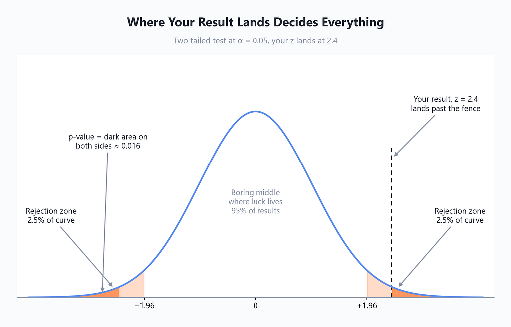
One detail matters more than it looks. We counted 8 or better, not exactly 8. If 8 correct impressed us, then 9 or 10 would have impressed us even more, so all of them belong in the “at least this weird” pile. That’s why the p-value is defined with “at least as extreme,” and why the picture below shows a shaded tail, not a single point.
And for the record, the exact answer without simulation is one library call.
from scipy import stats
# scipy is Python's science toolbox, stats is its statistics drawer
# k=8 hits, n=10 flips, p=0.5 is the "he's just guessing" claim
# alternative="greater" means we only care about better-than-chance
result = stats.binomtest(k=8, n=10, p=0.5, alternative="greater")
print(result.pvalue)
# 0.0546875, matching our simulation almost exactly
Now, the misquotes. This number gets mangled daily by people with PhDs, so let’s be blunt about what a p-value is not.
- It is not the probability that luck explains your result. We calculated it by assuming luck was the only thing operating. A number can’t measure its own assumption.
- It is not the probability my friend has powers. It says nothing directly about the exciting explanation.
- Small p does not mean the effect is big or useful. It means the effect is hard to blame on luck. With enough data, a uselessly tiny effect gets a gorgeous p-value.
A p-value answers exactly one question. How embarrassing is this data for the boring explanation? Nothing more. Every disaster in this article comes from people stretching it past that job.
The line in the sand, and the man who drew it with a shrug
So luck matches my friend’s coin trick 5.5% of the time. Is that rare enough to declare him gifted? We clearly need a cutoff, agreed on before the experiment, that separates “eh” from “whoa.”
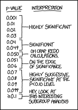
That cutoff is called the significance level, written as α (alpha). The ritual is simple. Pick α first. Run the experiment. If your p-value comes in below α, you reject the null and call the result statistically significant. If not, you fail to reject, and the boring explanation lives another day.
The nearly universal choice is α = 0.05, a 5% line. And where does that sacred threshold come from? From Fisher, the tea guy, casually remarking in the 1920s that one-in-twenty seemed like a convenient level of rarity to treat as noteworthy.
That’s it. That’s the origin story. The line that decides which medicines reach pharmacies and which research careers flourish is, historically, one Englishman’s shrug.
My friend’s p-value was 0.0547. The fence was 0.05. He missed being officially gifted by two coin flips’ worth of rounding, and no, he has not recovered.
Sensible fields move the fence to match the stakes. Physicists hunting the Higgs boson refused to announce until the evidence cleared roughly a one-in-3.5-million fluke standard, the famous five sigma. Meanwhile in 2011, a respected psychology journal published a paper claiming students could sense the future, backed by ordinary methods and p-values under 0.05. The methods weren’t broken. The fence is just low enough that occasionally something psychic strolls over it. Remember, one-in-twenty flukes will show up if you give luck twenty chances, which is precisely the loophole the chocolate study exploited. We’re nearly there.
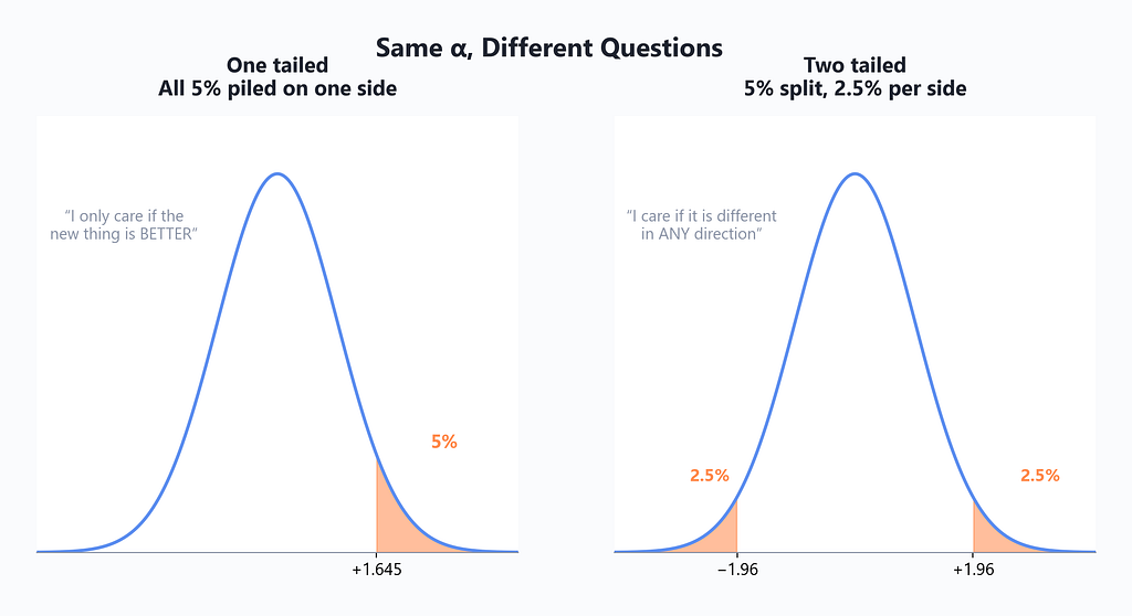
One more decision hides in the setup. If you’d only be impressed by my friend beating chance, you pile your whole 5% suspicion on one side, a one tailed test. If you’d also raise an eyebrow at him doing mysteriously worse than chance, you split the suspicion between both ends, two tailed. Two tailed is the humble default, because real effects love pointing the direction nobody predicted.

The four endings, two of them embarrassing
Here’s a truth textbooks bury on page 200 that belongs on page 1. Even when you do everything right, hypothesis testing sometimes lies to you. Not through error or fraud. By design. It’s a system for betting wisely under uncertainty, and bets sometimes lose.
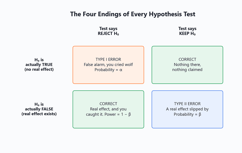
Reality has two settings, either nothing’s going on or something is. Your test also has two outputs, reject or don’t. Cross them and every test ever run lands in one of four boxes.
Two boxes are wins. The other two have names.
A Type I error is a false alarm. Nothing was happening, and your test yelled anyway. This happens, when the null is true, with probability α, because that’s literally what α is, the fraction of false alarms you agreed to tolerate. Run at 0.05 and roughly one in twenty of your no-effect experiments will produce a thrilling, publishable, wrong result.
A Type II error is a nap. Something real was happening, and your test slept through it. Its probability is called β, and the useful flip side, 1 minus β, is your test’s power, the chance it catches a real effect when one exists.
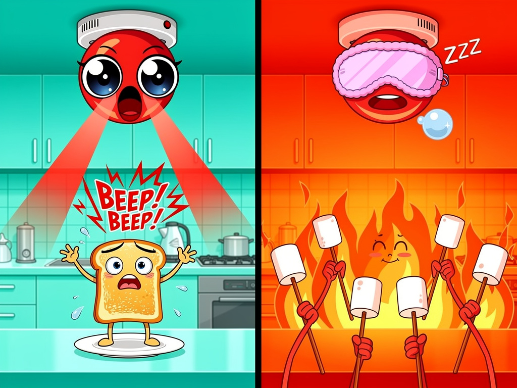
The smoke detector in your kitchen lives this trade-off daily. Crank its sensitivity up and it screams at slightly brave toast, false alarms, Type I. Turn it down and it might snooze through an actual fire, Type II. You cannot fix both by fiddling with the dial, because the dial only trades one error for the other. The only genuine upgrade is a better detector.
In statistics, “a better detector” has an exact meaning. More data.
The green button that fooled me personally
Time to confess my own chocolate study.
A few years ago I ran an A/B test on a signup page. Old page, 4,000 visitors, 480 signups, a 12% conversion rate. New page with a green button, 4,000 visitors, 552 signups, 13.8%. The dashboard glowed green in every sense. I announced it. There were emoji reactions.
Was I right to celebrate? We now own every tool needed to check, so let’s actually run the trial, and I’ll explain each line like it’s your first week with Python.
import numpy as np
from scipy import stats
# Step 1, the raw evidence
old_signups, old_visitors = 480, 4000
new_signups, new_visitors = 552, 4000
p_old = old_signups / old_visitors   # 0.120, the old rate
p_new = new_signups / new_visitors   # 0.138, the shiny new rate
# Step 2, the null hypothesis made concrete
# H0 says the button changed nothing, both pages share ONE rate,
# so our best guess of that shared rate uses all 8,000 visitors
p_both = (old_signups + new_signups) / (old_visitors + new_visitors)
# Step 3, how big a gap does LUCK typically create between
# two identical pages with this much traffic? This is the
# standard error, think of it as the typical size of luck
se = np.sqrt(p_both * (1 - p_both) * (1/old_visitors + 1/new_visitors))
# Step 4, measure MY gap in units of luck-sized gaps
z = (p_new - p_old) / se
# Step 5, convert to a p-value, two tailed because a button
# can hurt as easily as it helps. norm.cdf gives the area
# under the bell curve left of z, so 1 minus it is the tail
p_value = 2 * (1 - stats.norm.cdf(abs(z)))
print(f"z = {z:.2f}, p-value = {p_value:.4f}")
# z = 2.40, p-value = 0.0163
Read the comments top to bottom and the logic is Fisher’s teacups again. Assume boring (one shared rate). Ask what luck typically does (the standard error came out near 0.0075, meaning identical pages usually drift about 0.75 percentage points apart just by chance). Then measure how many luck-units my gap covers. My 1.8-point gap is 2.4 luck-units wide, and gaps that wide arise by chance only 1.6% of the time.
0.0163 is under 0.05. Statistically significant. Reject the null, the button did something, and the earlier bell-curve diagram is literally this test drawn to scale, my z of 2.4 sitting past the 1.96 fence.
So the celebration was justified?
Slow down. Significance answered “is this luck?” It never answered “how big is it, really?” and it definitely never answered “was your experiment even strong enough to be trusted?” Look what happens when we check that last one.
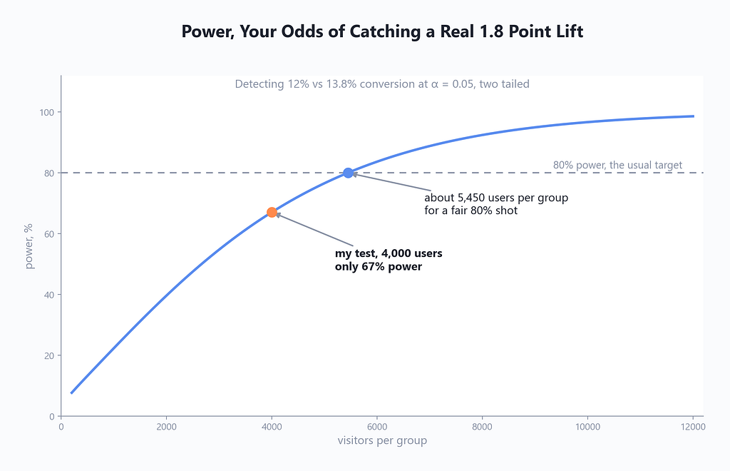
My test’s power was 67%. Meaning if the button’s effect was real, a test my size still misses it one time in three, and standard practice says aim for at least 80%, which needed about 5,450 users per group. I got lucky in the good direction, this time. Underpowered tests are silent killers of good ideas, they nap through real effects, and then someone writes “green buttons don’t work” in a company wiki, forever.
If you keep one habit from this section, keep this one. Before trusting any test’s verdict, yours or anyone’s, ask two questions. How big is the effect? And did the experiment have a realistic chance of catching an effect that size in the first place?
Confidence intervals, or answering with a net instead of a spear
“The lift is 1.8 percentage points” sounds precise and confident. It’s also almost certainly wrong. Not badly wrong, but the true lift is essentially never exactly your sample’s number, the same way your commute is never exactly the average commute.
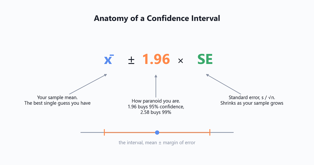
Grown-up statistics answers with a range. Here’s the entire recipe.
import numpy as np
# Same button data, but now I want a RANGE for the true lift
p_new, p_old = 0.138, 0.120
n_new, n_old = 4000, 4000
lift = p_new - p_old   # 0.018, my single best guess
# Each page's rate carries its own wobble, and the wobble of a
# difference combines both, added under a square root
se_lift = np.sqrt(p_new*(1-p_new)/n_new + p_old*(1-p_old)/n_old)
# 1.96 is the magic width that covers the middle 95% of a bell
# curve, want 99% instead? use 2.58 and accept a wider range
low = lift - 1.96 * se_lift
high = lift + 1.96 * se_lift
print(f"95% CI for the lift, {low:.4f} to {high:.4f}")
# 0.0033 to 0.0327
So the honest sentence about my glorious button is this. The true lift is plausibly anywhere from 0.3 points to 3.3 points. The top of that range is ten times the bottom. My dashboard’s proud “+1.8” was hiding an entire identity crisis, and this is why journals and serious data teams increasingly demand intervals instead of bare verdicts. A verdict says “not luck.” An interval says “not luck, and here’s how big it might be, and here’s how unsure we are.” Three answers for the price of one line of arithmetic.
Two beautiful details before we move on.
First, notice zero is not inside my interval. That’s not a coincidence, it’s a theorem in disguise. A 95% interval that excludes zero and a two tailed test rejecting at α = 0.05 are the same fact expressed two ways. If your interval contains zero, your p-value is above 0.05, always, like clockwork.
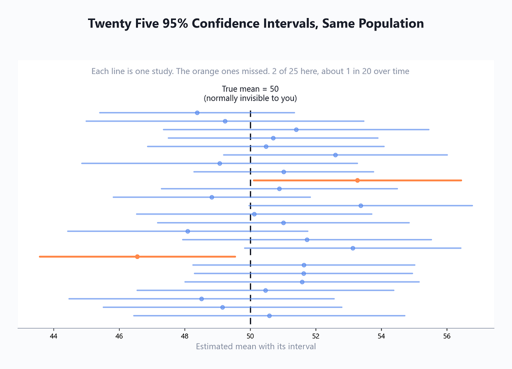
Second, the phrase “95% confident” has a precise meaning, and it’s about the method, not your one result. Run the recipe on fresh data forever, and about 95% of the intervals it spits out will contain the truth. Any single interval either caught it or didn’t, and you’ll never know which kind you’re holding. What you know is the reliability of the net.

Now, the chocolate trick
You now know enough to rob a casino, so let’s watch someone do it.
Bohannon’s chocolate study had about 15 volunteers, split into groups, one of which added a daily bar of dark chocolate to a low-carb diet. So far, just a small study. The sting was in the measuring. His team recorded 18 different things about each person. Weight, cholesterol, sleep quality, blood pressure, sodium, mood, on and on.
Do the casino math with me. Each measurement is a fresh hypothesis test, a fresh chance for luck to sneak under 0.05. One test carries a 5% false alarm risk. Eighteen tests? The chance that at least one comes up “significant” by pure luck is about 60%. Bohannon later put it plainly, running that many measurements on that few people makes a “significant” headline nearly guaranteed, you just can’t know in advance which measurement will win the lottery.
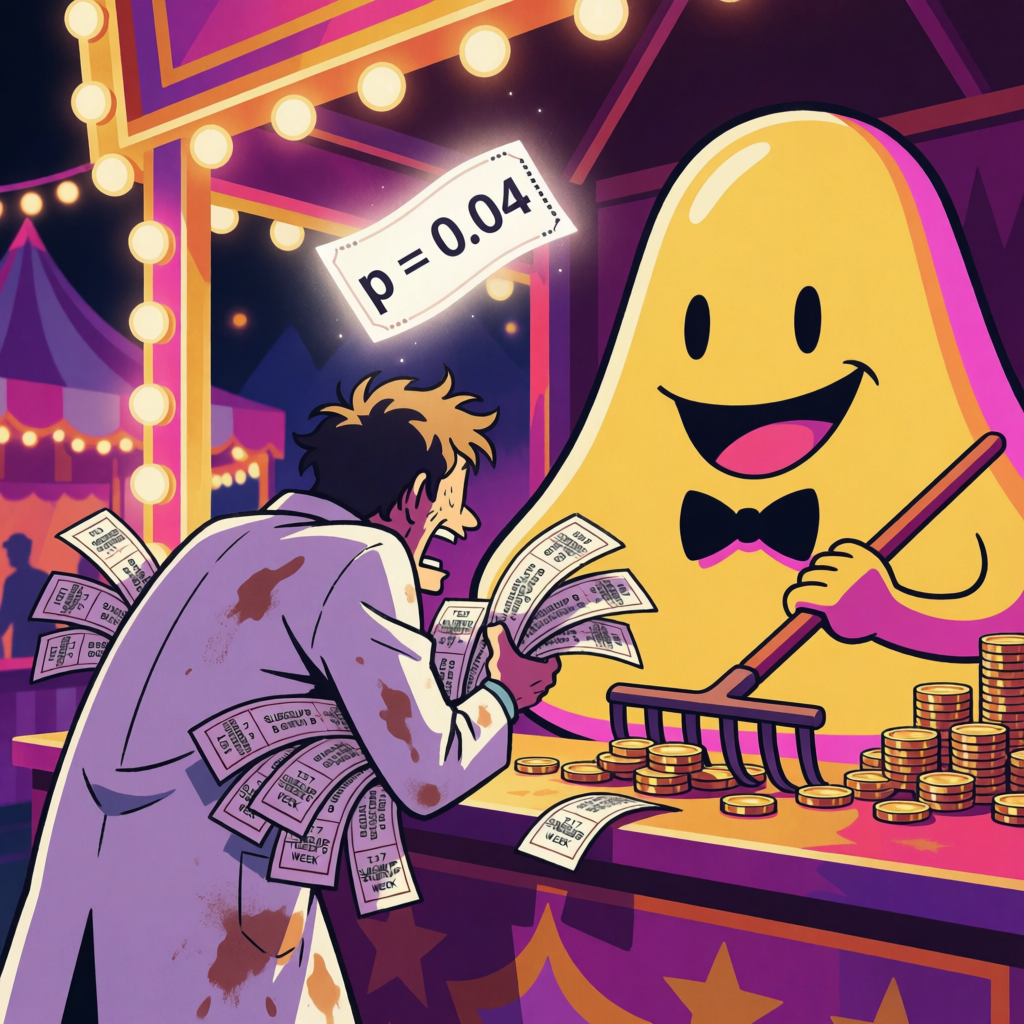
Weight loss happened to win. Hence “chocolate accelerates weight loss,” technically supported by a real p-value under 0.05, morally equivalent to a rigged carnival game. The reporters who ran the story never asked how many other measurements were taken. That one question would have killed it.
This move has a formal name, the multiple comparisons problem, and an informal one, p-hacking. And once you know it exists, you see it everywhere.

Science’s own house has the same termites. In 2009, a neuroscientist named Craig Bennett put a subject in an fMRI brain scanner, showed it photos of humans in social situations, and asked it to identify their emotions. The scan found statistically significant brain activity.
The subject was a dead salmon. From a fish market.
The point wasn’t zombie fish. A brain scan slices the brain into thousands of tiny regions and effectively runs a hypothesis test on each one, thousands of coin flips, so a few come up “significant” somewhere even in dead tissue, unless you mathematically correct for the number of tests. At the time, a scary fraction of published brain studies didn’t correct. The salmon paper embarrassed the field so effectively that non-correcting papers dropped dramatically within a few years, and the team won an Ig Nobel Prize, the award for research that makes you laugh and then think.
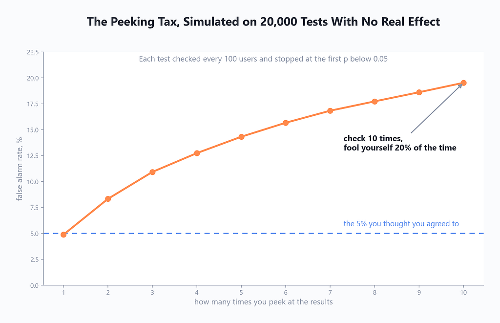
And it’s not always twenty separate tests. Sometimes it’s one test, peeked at twenty times. Check your A/B dashboard daily and stop the moment p dips under 0.05, and you’ve quietly multiplied your false alarm rate. I simulated it so you don’t have to.
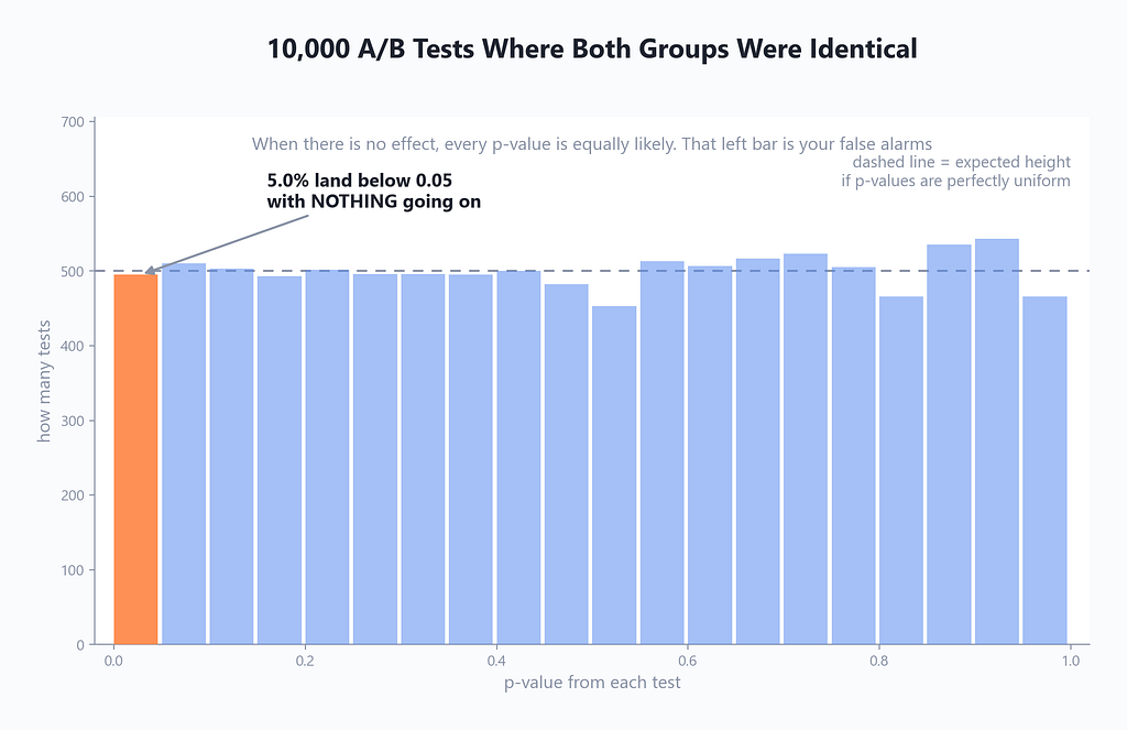
Why does all this cheating work so smoothly? Because of one gorgeous, under-taught fact. When nothing is going on, p-values don’t cluster near 1 like intuition suggests. They spread out perfectly evenly between 0 and 1. A p of 0.03 is exactly as likely as a p of 0.83 when the effect is zero. The lottery tickets are uniformly distributed, so anyone who buys enough tickets, extra measurements, extra subgroups, extra peeks, will eventually hold a winner.
The fallout from all this is not hypothetical. In 2015, a huge collaboration re-ran 100 published psychology studies as exactly as possible. Only around 36% of the “significant” findings held up, and the effects that did survive shrank to about half their original size. Whole shelves of findings, the kind that had made it into books and corporate trainings, evaporated on the second look.
The defenses, thankfully, are boring and learnable. Decide your hypothesis, your α, and your sample size before touching data, in writing, where your future self can’t renegotiate. If you genuinely must run twenty tests, tighten the fence, the simplest fix, called Bonferroni, is dividing α by the number of tests. Report effect sizes and intervals, not just verdicts. And treat any single exciting result, especially your own, as a lead to replicate, not a truth to frame.
The whole ritual on one napkin
Everything above compresses into six steps, and the order is the safety mechanism. Step 2 before step 3, always, or you’re the chocolate guy.
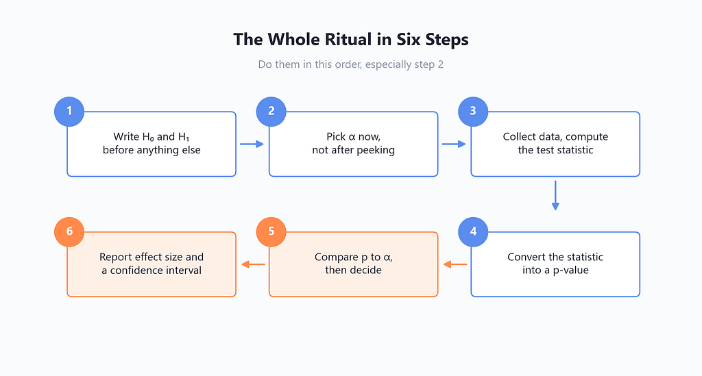
And here’s the cheat sheet version, suitable for taping inside a notebook.
+----------------------+---------------------------------------------+
| Term                 | Plain meaning                               |
+----------------------+---------------------------------------------+
| Null hypothesis, H0  | "Nothing's going on, it's luck"             |
| Alternative, H1      | "Something real is happening"               |
| p-value              | How often luck alone matches your result    |
| Alpha, usually 0.05  | Your false alarm budget, picked in advance  |
| p below alpha        | Reject H0, call it significant              |
| p above alpha        | Not proven. NOT the same as "no effect"     |
| Type I error         | False alarm, happens at rate alpha          |
| Type II error        | Real effect missed, happens at rate beta    |
| Power, 1 minus beta  | Odds you catch a real effect, want 80%+     |
| 95% CI               | A net that catches the truth 19 times in 20 |
| Significant          | Means "hard to blame on luck", nothing more |
+----------------------+---------------------------------------------+
What I actually want you to remember
Not the formulas. You can re-look-up formulas forever, that’s what search boxes are for.
Remember the questions. When any number swaggers up to you claiming something works, a supplement, a productivity hack, a redesign, a “study says”, you now own four questions that cut straight through.
Could this just be luck? How big is the effect, with a range, not a point? How many things did they test before this one worked? And could their experiment even have caught the effect it claims, or was it napping?
Those four questions are the entire self-defense course. The chocolate hoax dies at question three. The dead salmon dies at question three. My button euphoria gets properly humbled by questions two and four. And your cousin’s three sixes, well, that one you already knew how to handle before you ever heard the word “hypothesis.”
Statistics was never the villain subject. It’s the suspicious friend who asks the annoying question at the right moment.
Hypothesis Testing Is Just a Courtroom With Worse Snacks was originally published in Towards AI on Medium, where people are continuing the conversation by highlighting and responding to this story.
