
I Sketch Every Power BI Report in Figma Before Touching the Data
Fifteen minutes of paper-and-pixel work that saves me a week of stakeholder iteration cycles — and the UI/UX principles I quietly borrow from my past life.
A dashboard I shipped two years ago opened with twelve KPI cards on the front page.
Twelve. All competing for attention. Each one a different colour, a different size, a different chart type underneath. I was proud of it. I’d built every one of those cards myself, written the DAX, tuned the visuals. It was the most technically sophisticated thing I’d shipped that quarter.
The stakeholder who’d commissioned it looked at the live version for about ten seconds and said: “I don’t know what I’m supposed to do with this.”
That sentence is the reason I now open Figma before Power BI. Not for every report — I’ll get to the exceptions. But for any report that’s going to land in front of a decision-maker, the first fifteen minutes happen in Figma, on paper, or in any tool that isn’t the one I’m going to eventually build in. The data comes later. The structure comes first.
What Fifteen Minutes in Figma Actually Looks Like
I want to be honest about how unfancy this is. The version that lives in my head isn’t elaborate. It’s not a full mock-up with the exact font and colour palette and pixel-perfect spacing. It’s much simpler than that, and the simplicity is the point.
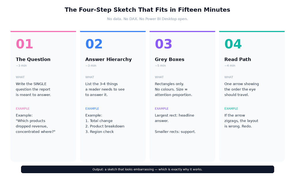
A typical sketch session has four steps, and the whole thing fits in a quarter of an hour:
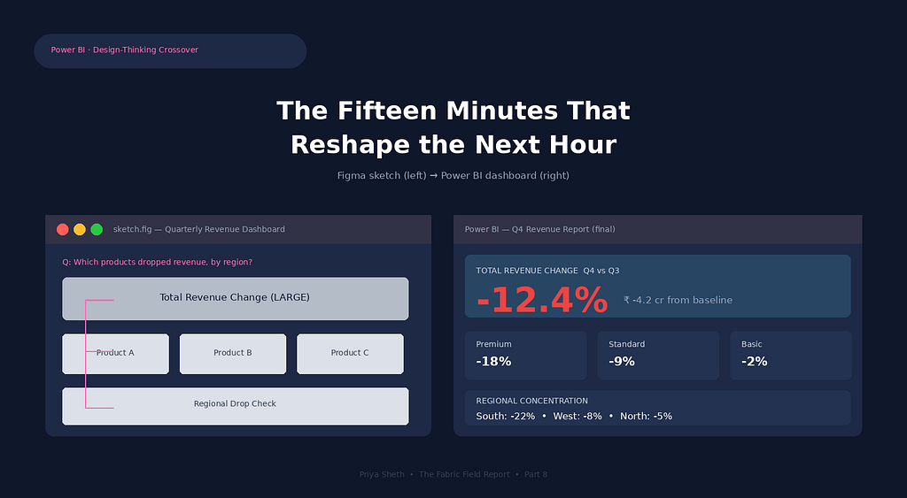
Step one — the question. Before any rectangle gets drawn, I write the single question the report is meant to answer at the top of the canvas. Not “show sales performance.” Specifically: “Which products dropped revenue this quarter, and is the drop concentrated in one region?” If I can’t write the question in a single sentence, the report isn’t ready to design. That alone has saved me from building reports that didn’t need to exist.
Step two — the answer hierarchy. I write, in plain text, the three or four things a reader needs to see to answer that question. Total revenue change, then product-level breakdown, then regional concentration check. That’s it. No fourth thing. The act of deciding what comes second forces a decision about what comes first, which is where most analysts fail without realising it.
Step three — the grey boxes. Now the canvas gets rectangles. One rectangle per piece of information. No colours, no data, no actual numbers — just grey blocks sized roughly proportional to the visual real estate I’m willing to give each one. The biggest rectangle goes to the question’s primary answer. Secondary information gets smaller rectangles. If a stakeholder might glance at this on a phone screen during a meeting, the rectangle that holds the headline number needs to be readable at thumbnail size.
Step four — the read path. I draw a single arrow showing the order a reader’s eye should travel. Top-left to bottom-right, usually, because that’s how most languages train us to read. If the arrow can’t go cleanly from the most important rectangle to the supporting ones without zigzagging, the layout is wrong. Rearrange the rectangles until the arrow flows.
That’s the whole exercise. No screenshots, no real data, no DAX, no Power BI Desktop open in a tab. Fifteen minutes, give or take. The output is a low-fidelity sketch that looks embarrassing if anyone sees it — which is exactly why it works.
Why Skipping This Step Quietly Wastes Your Week
The cost of not doing the sketch isn’t visible in the moment you skip it. It shows up later, in two specific places I want to name.
The first is stakeholder iteration cycles. When you build a report directly in Power BI without a sketch, you’ve already invested two hours in DAX measures, relationships, conditional formatting, and visual tuning before the first stakeholder sees it. When they say “this isn’t quite what I needed” — and they will, because no one can describe a dashboard accurately in words — you’re now in the position of arguing for what you built rather than redesigning it. The sunk cost of two hours of technical work makes you defensive about layout choices that, in a sketch, you’d have happily thrown away.
I’ve watched this happen to senior analysts who definitely know better. The Figma version is twenty grey rectangles you can rearrange in ninety seconds. The Power BI version is a relationship model and a measure library you’d have to renegotiate to change the structure. The artefact you sketch first is the artefact you can still afford to change.
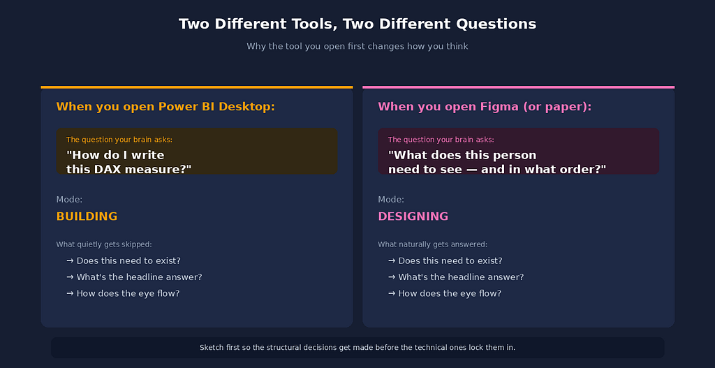
The second cost is the question that didn’t get asked. A blank Power BI canvas suggests building. A blank Figma canvas suggests thinking. The act of opening a non-data tool changes the kind of attention you bring to the work — you’re not solving “how do I write this DAX measure,” you’re solving “what does this person actually need to see and in what order.” Those are completely different problems. The first one has good solutions and good tools. The second one only gets answered if you give it time before you start building.
Three UI/UX Patterns I Borrowed That Work for BI
This is where my old design career earns its place in my current data work. There are specific patterns from interface design that map directly onto BI reporting, and I use them constantly without always announcing it. Three I’ll name because they’re the highest-leverage:
Visual hierarchy follows decision hierarchy. In app design, the most-tapped button is the largest and the most colour-saturated. In BI reporting, the most-decided-on number should be the largest and the most visually weighted. That sounds obvious, and yet I keep seeing executive dashboards where the “Total Revenue” card is the same size as “Number of Active Vendors.” If you’re not sure which number deserves the largest card, ask your stakeholder which number they’d want to know if they could only know one. The answer is the headline. Everything else is supporting evidence.
Whitespace is not wasted space. Junior designers and junior BI developers both fight whitespace because it feels like an opportunity to add one more chart. Senior designers and senior BI developers protect whitespace because it’s what makes the remaining content readable. A dashboard with five charts and generous spacing communicates more than a dashboard with twelve charts crammed together. The reason is the same in both contexts: human visual processing has a finite bandwidth. If you make the reader’s eye work harder, they understand less.
Progressive disclosure beats comprehensive disclosure. In app interfaces, hiding advanced settings behind a “more options” toggle is a good thing — it protects the 95% of users who don’t need them from being overwhelmed. In BI reporting, the equivalent is letting the first page answer the headline question, and putting the diagnostic detail on a drill-through or a secondary page. Don’t try to fit everything on page one. The page that tries to answer every question answers none of them.
These three principles are the bones of every successful dashboard I’ve shipped. None of them require Figma specifically. What Figma does is force me to apply them before I’m too invested in technical decisions to make the structural ones cleanly.
What I Don’t Use Figma For
To be honest, this practice isn’t universal. There are three kinds of reports where I skip the Figma step, because the sketch overhead doesn’t earn its place:
Ad-hoc analyst-to-analyst exploration. When I’m pulling data for myself to answer a one-off question — sales by region last quarter, anomaly detection on a specific transaction set — I open Power BI Desktop directly. No stakeholder, no audience, no read path that matters. The sketch step is only valuable when there’s a future reader I’m designing for.
Reports that already have an established template. Our finance team has a standard monthly close dashboard. Same structure every month, just refreshed data. There’s nothing to design — the design was already settled the first time this template was built, possibly by someone else. I add this month’s data and move on.
Diagnostic dashboards that are only ever consumed by me or my own team. The reconciliation dashboard from the framework I built is functional, not designed. It exists to show whether anything’s broken; if it ever looks pretty, I’ve over-invested in the wrong thing.
The principle is: sketch when the audience is someone whose decisions you’re trying to support, not when the audience is yourself. If you’re the only consumer, the report can look however the data wants it to look.
The Senior Version of This Practice
I want to address the senior version of this idea, because the junior version is easy to mistake for the whole thing.
The junior version is: “sketch your reports in Figma so they look nice.” That’s not wrong, but it’s incomplete and slightly misses the point. The senior version is: “the layout of a report is a decision about what the reader will pay attention to, and that decision deserves the same care you give to a DAX measure.” The Figma step isn’t really about Figma. It’s about creating space, before the data is on the canvas, to make structural decisions that are very expensive to change later.
You can do this with paper. You can do this with PowerPoint. You can do this in a whiteboard tool like Miro, or in the back pages of a notebook. The tool doesn’t matter much. What matters is that the tool you sketch in is not the tool you’ll eventually build in, because the moment you open Power BI Desktop, your brain shifts from designing into building, and the structural questions stop getting asked.
The other senior insight is that this practice gets more valuable as your stakeholders get more senior. A junior analyst can iterate freely on a dashboard with three stakeholder reviews and still ship within the week. A senior executive will give the dashboard ten seconds of attention exactly once. If the structure isn’t right in those ten seconds, the dashboard fails — and you won’t get a second meeting to fix it. The fifteen minutes of sketching is what increases the odds those ten seconds go well.
What I’d Tell Other Analysts
If you’ve never opened a design tool, don’t. The point isn’t the tool. The point is the pause between receiving a request and opening Power BI — a pause long enough to ask what question the report is for, what answer hierarchy supports it, and what read path the eye should follow.
For most analysts, the right thing to do isn’t to learn Figma. It’s to start sketching dashboards on paper for ten minutes before opening Desktop. The paper version of the same exercise gives you 80% of the value with zero learning curve. The reason I use Figma specifically is muscle memory from my design career, not because Figma is better than a sticky note.
The shift I’m trying to suggest is smaller than “learn UI/UX design.” It’s: treat the layout of a report as a decision that deserves its own time, separate from the decision about which measures to build. If you do that for thirty days on every stakeholder-facing report you ship, the rate at which your dashboards get iterated by stakeholders will fall noticeably. That’s the operational payoff. The aesthetic improvement is a side effect.
I Sketch Every Power BI Report in Figma Before Touching the Data was originally published in Towards AI on Medium, where people are continuing the conversation by highlighting and responding to this story.